Extending CSS With Sass
CSS is designed primarily to enable the separation of content from presentation, including elements such as the layout, colors, and fonts. This separation improves content accessibility and provides more flexibility and control over the presentation. CSS is quite flexible language on its own, but as websites become more and more complex we sometimes need to have more control.
I’m using Sass to extend the basic behavior of CSS and this post is mostly about some basic things I’m using. I’ll also assume that you know something about Sass already and that’s why I won’t dive deep into what it actually is. If you are running OS X, you can get Sass up and running using these two commands below. The first one installs Sass Ruby gem and the second one translates your .scss file into a .css file.
gem install sass
sass --watch style.scss:style.css
Partials #
Using Sass’s @import you can organize your styles into a smaller partials. @import in Sass works a bit differently if compared to CSS @import statement. The difference is that when Sass is processed all the partials will be combined into a single CSS file which reduces unnecessary HTTP requests and speeds up the loading time. I usually have one “main” Sass file where I have all my variables, mixins, etc. and where I do the importing.
@import "fontface";
@import "reset";
@import "header";
@import "content";
@import "footer";
@import "print";
This way you can separate different sections/features.
Variables #
Variables are good when you need to, for example, use the same colors again and again. They allow you to specify widely used values in a single place and I usually specify them as the first thing in my main stylesheet.
$color-red: rgb(124,42,0);
$color-blue: rgb(0,109,143);
$color-green: rgb(55,87,25);
$font-body: sans-serif;
$font-headers: "PTSansCustom", Arial, sans-serif;
And then later we can use them like this:
h1 {
  font-family: $font-headers;
  color: $color-blue;
}
The benefit of this is that when you need to later adjust or change that shade of blue, you only need to change it to one place.
Converting Pixels to EMs #
One of the most useful features for me has been the ability to convert pixels to EMs without the need to use calculator. This function below does that and it works by taking two arguments, pixels and context. You can either use the default context and specify only the pixels you want to convert – or you can specify pixels and a custom context for the conversion.
$browser-context: 16; // Default

@function em($pixels, $context: $browser-context) {
  @return #{$pixels/$context}em
}
And then later this function can be used like below (converts 36px to EM units):
h1 {
  font-size: em(36);
}
If you’ve converted all your pixels to EMs you can even scale the whole layout inside Media Queries with this simple percent conversion:
@media screen and (min-width: 60em) {
body { font-size: percentage(16 / 16); }
}
@media screen and (min-width: 80em) {
body { font-size: percentage(18 / 16); }
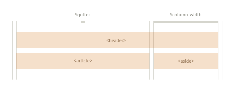
}Making a simple grid system #
Making your own grid system is also pretty straightforward in Sass. The following example is a Sass @mixin from David Demaree’s article on A List Apart which takes one argument—$span—which will be passed into our @mixin as a variable:
$column-width: 21em;
$gutter: 1.5em;

@mixin grid($span) {
  float: left;
  margin-right: $gutter;
  margin-bottom: $gutter;
  width: ($column-width * $span) + ($gutter * ($span - 1));
}
And then later that mixin can be used with containers using simple @include:
header {
  @include grid(3);
}

article {
  @include grid(2);
}

aside {
  @include grid(1);
  margin-right: 0;
}
To make this a bit easier to understand, our grid (layout) would now look like this when containers are laid on top of it:
More Resources #
I’m just scratching the surface here on what’s possible, and I suggest you to read more about some of these techniques from A List Apart and from the resources I’ve provided below.
