We love typefaces. They give our sites and applications personalized feel. They convey the information and tell a story. They establish information hierarchy. But they’re also full of problems. Typefaces make our websites slow. They produce FOUT — or FOIT if you prefer. They render in unpredictable ways. Why should we live with inflexible type that doesn’t scale, when the core nature of our medium is fluid and responsive?
Why should we live with inflexible type that doesn’t scale, when the core nature of our medium is fluid and responsive?
TLDR; We don’t have to. Three weeks ago, Apple, Google, Microsoft and Adobe introduced a new font format called Variable Fonts. In a gist, Variable Fonts provide the flexibility of multiple fonts in a single file that can adapt fluidly to any type of screen or device. One font, near infinite variations.
When using web fonts today, you have to load separate font files for each style and weight, resulting in long download times and FOUT/FOIT. With Variable Fonts, we can request just one highly optimized file including all the weights and styles of a typeface. This is a tremendous shift that I see leading to richer, more responsive typographic experiences and vastly expanding the possibilities for web typography.
Back in 2004, when I had just started my career, sIFR was the hottest thing out there. It was developed by Shaun Inman and it embedded custom fonts in a small Flash movie, which could be utilized with a little bit of JavaScript and CSS. At the time, it was basically the only way to use custom fonts in browsers like Firefox or Safari. The fact that this technique relied on Flash soon made it obsolete, with the release of the iPhone (without flash) in 2007.
Our interfaces are written, text being the interface, and typography being our main discipline.
In 2008, browsers started eventually supporting the new CSS3 @font-face rule. It had already been a part of the CSS spec in 1998, but later got pulled out of it. I remember the excitement when I managed to convince one of our clients to utilize the new @font-face and rely on progressive enhancement to deliver an enhanced experience for browsers which already supported this feature.
Since my early days in the industry, I’ve grown to love type and all the little nuances that go into setting it. In this article, I want to share some of the fundamentals that I’ve learned, and hopefully help you get better at setting type for user interfaces.
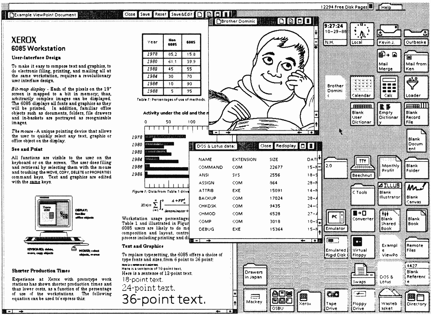
While the history of typography dates back about five thousand years, we’ve had graphical user interfaces for mere four decades. One of the key turning points was in 1973, when Xerox introduced Alto, which in essence created the foundation for today’s graphical UIs. Alto was born a decade before any other GUI hit the mass market, and was seen as the future of computing.
This early development for Alto evolved to Xerox Star in the 80s and became the first commercial operating system with GUI.
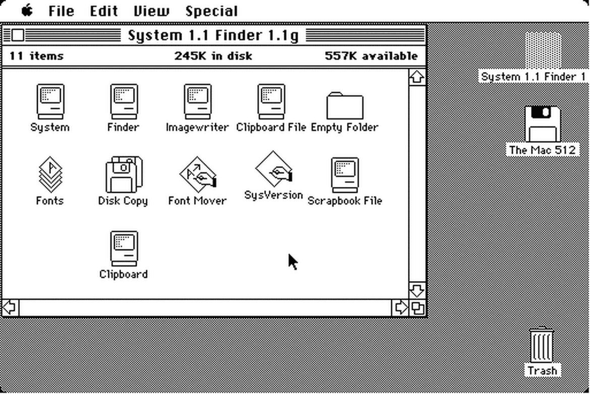
Although neither Alto nor Star never really took off the ground, they greatly influenced the future development at Apple and Microsoft with their revolutionary mouse-driven GUI. A couple years later, in 1984, Steve Jobs introduced the first Mac OS.
The release of the Macintosh meant custom typography suddenly becoming available to the masses for the first time ever. The original Mac came pre-installed with many iconic typefaces, and over the next few years, multiple type foundries started releasing more and more digital versions of their popular typefaces.
When inspecting these early graphical user interfaces closer, we realize that most of their elements are written language. These GUIs are essentially pure text — collections of singular words displayed in isolation from one another.
We can make a similar observation by inspecting almost any modern interface too. Our interfaces are written, text being the interface, and typography being our main discipline.
I’m terribly excited to tell that we’re moving to San Francisco Bay Area in the beginning of 2016! I’m joining a new company, Idean, as a Senior Interaction Designer and Iisa will be starting preschool there, which makes this a tremendous change for the whole family. All of this is something we’ve been planning for a while already, so we’re thrilled that it’s finally happening.
As of today, we’ve packed everything we have—from the 12" record collection to Iisa’s toys—into a shipping container and it’s already in the harbor waiting to get shipped to the United States. We’re still staying in Finland for the Christmas, seeing relatives and enjoying some quiet time, before flying to San Francisco in January.
It’s been interesting few years at Adtile, and I’m grateful for all the things I’ve learned, but it’s time to move on towards new adventures.
I designed the 3rd edition of this website almost 5 years ago, which is an eternity by today’s standards. The previous version was one of the first responsive websites out there that was built mobile first from start to finish. Everything was also done progressive enhancement in mind, which made it last well throughout the years.
Lately, however, I’ve wanted to learn to trust my own instincts more and let go of the imaginary feeling of control we’ve created for ourselves.
But as with many personal projects, there eventually came a point when the content started becoming obsolete, type didn’t work anymore like I wanted it to, and even updating the website became so terrible experience that I just stopped doing it.
It was time to rethink. After some pondering, I came up with these 6 goals for the new version:
Build a design system.
Focus on the content, typography and readability.
Better performance and faster loading.
Switch to HTTPS and provide an offline experience.
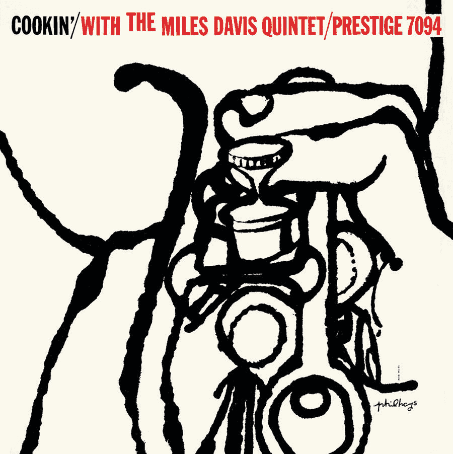
Reid Miles was an American modernist designer, a genius of his time, best known for his work for Blue Note Records through the 1950’s and 60’s. During this period he designed almost 500 record covers for the label. This article is a tribute to Miles, who’s work continues to inspire me and many others.
It’s the summer of 1998—a long wait has finally come to an end. After saving for months I’ve acquired my first turntable. It’s Technics SL-1210 MK II and I am carrying it uphill towards home that is nearly two and a half miles further. The package weighs 26 pounds, not an easy task for the scrawny teenager I was back then.
He was a genius, ahead of his time, and the way he treated the typography as visual elements that can be broken apart and form something new still feels fresh.
I remember vividly how I after arriving tear apart the package, took out all the gleaming parts, put them together, and the great enthusiasm and eagerness I felt inside. I also remember how I connected the turntable to the speakers and played the first vinyls I had picked up months earlier.
There I was, eyes closed, letting the unison of the brasses sink into my brain.
Seventeen years later, that same turntable still looks and works like a brand new thing. It was and still is an amazingly well built piece. I feel the same about the work of Reid Miles. He was a genius, ahead of his time, and the way he treated the typography as visual elements that can be broken apart and form something new still feels fresh.[1]
I didn’t know it back then, but the day I bought the turntable and started collecting vinyls shaped my future career as a designer. Slowly through the years the jazz music and artworks of these 12" records became the main source of inspiration for me.
Reid Miles was born in Chicago on the 4th of July 1927, American Independence Day, making him only twelve years old when Blue Note was founded. When the Stock Market crashed in 1929, Miles’ parents divorced and he moved with his mother and younger sister to Long Beach, California. After high school Miles joined the Navy and, following his discharge, moved back to Los Angeles to enrol at Chouinard Art Institute.
According to Miles himself, he didn’t enrol because of some lofty ambitions towards art. He told in a series of interviews that he did it because of a girl who he was dating at the time. Miles had also just returned from World War II and could use the G.I. Bill education benefits. To him, it felt like a better idea to go to an easy art school than somewhere else. The dating didn’t work out—but three months later, things just clicked and Miles knew what he wanted to do.[2]
After finishing his studies at the Chouinard Art Institute, Miles headed towards New York to look for a job with the biggest portfolio he could possibly find.
If the portfolio didn’t fit on the desk, I wasn’t talking to the right person. You need a fierce competition to do good work and when I started out, I would be competing against 11 other people for a job as an assistant to an art director at a little agency.”
John Hermansader, an American painter and a graphic designer, gave Miles his first job in New York. One of Hermansader’s clients at the time was Blue Note Records, which eventually led to Miles’ involvement too.[2]
In 1951, when Blue Note began releasing 10" records, Hermansader—who later hired Miles—was one of their first designers. Many don’t know that Hermansader, along with Paul Bacon, were the ones who did the groundwork for Blue Note’s design style, which Miles then continued to develop further with his own unique twist.
Late in 1955, Blue Note made the change to 12" record format. It was around this same time when the company hired Reid Miles as their Art Director and asked him to adapt their existing cover concepts to the new, larger format. Miles started his work from Blue Note BLP-1509 by Milt Jackson and The Thelonious Monk Quintet, and went on, designing almost 500 covers during a period of 15 years.
In the Fifties, Miles often worked in close collaboration with Andy Warhol, who helped him turn his concept designs to illustrations. One of the most famous results of this joint effort between the two is the cover of The Congregation by Johnny Griffin, which has reached an iconic status in the history of jazz. Later on Miles’ and Warhol’s relationship even led to him posing nude for one of Andy’s famous portraits.[5]
Although Warhol and artists such as Harold Feinstein were also working for Blue Note, it wasn’t until Reid Miles took over as the Art Director that the label could match the design style with its legendary ‘Blue Note sound.’ Whether this meant Miles’ creative use of black and white photographs or the way he treated the typography, “Miles made the cover sound like it knew what it lay in store for the listener” writes Felix Cromey in The Cover Art of Blue Note Records.[3]
Fifty Bucks an album…they loved it, thought it was modern, they thought it went with the music…one or two colors to work with at that time and some outrageous graphics!”
Reid Miles’ association with the label ended around 1967 when Alfred Lion, one of the founders of Blue Note, retired. Miles later returned permanently to Los Angeles, where he became famous for being paid $1,000,000/year to produce Coca-Cola ads that mimicked Norman Rockwell paintings. Quite a contrast to the fifty bucks an album that he was paid by Blue Note.
Miles continued working in his Hollywood studio for various clients until a massive coronary in 1993, which lead to his somewhat dramatic death.[4]
During the Fifties, when the design industry was in flux, Reid Miles pushed forward the way the typography is treated with his bold, playful designs, creative use of typefaces, and his distinct preference for contrast and asymmetry.
Personally, I’d like to think, that Reid Miles did the same to modern typography, as Charles and Ray Eames did to modern architecture and furniture.
I think typography in the early Fifties was in a renaissance period anyway. It happened especially on album covers because they were not so restrictive as advertising.”
A selection of Reid Miles’ designs from the 1950’s and 60’s. Most of these covers Miles designed for Blue Note, but there are few others included as well. Let the work speak for itself. ❦
During the winter 2014, me and my family rented an apartment from San Diego, CA for few months through my work. While staying there, we had an AT&T hotspot device that provided the network connection. For us, relying on this device, meant constant drops of connection, network latency like we’ve never seen before, and websites that were completely broken because JavaScript wasn’t loading at all. A part of this can be explained by the poor reception at the location where we were staying, but overall, the whole experience put me thinking.
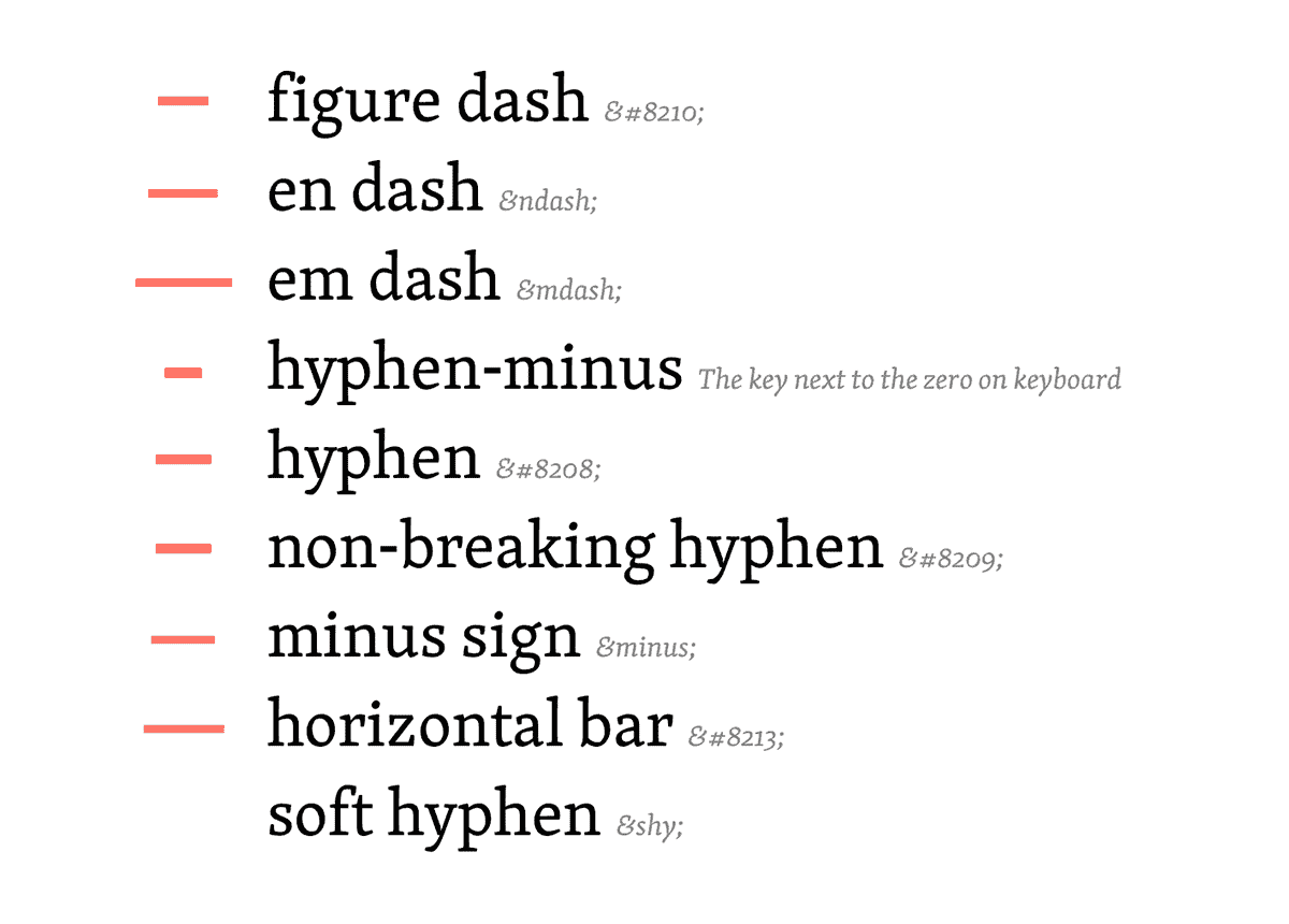
This is an experiment I did months ago, but eventually never ended up posting it here. I had already forgotten the whole thing until it few weeks ago suddenly started popping up on my Twitter and Facebook timelines via other people. It’s a simple one pager you can use for example as a cheatsheet for various dashes.
 Image credit: Erik van Blokland