Remote preview is a tiny JavaScript based tool which I built for our test lab. It allows you to preview any URL on large number of mobile devices simultaneously. Just enter a URL, hit enter, and new URL gets automatically loaded on each device. Remote preview works on platforms like Android, Blackberry, iOS, Maemo, Meego, Symbian, Windows Phone and WebOS.
Remote Preview is a tiny JavaScript based tool that allows you to preview any URL on large number of mobile devices simultaneously.
Remote Preview works by making an ajax call every 1100ms to check if the url in the ‘url’ file is changed. If it is, the script will then change the src attribute of the iframe and load a new page into it. If there’s no changes, the script will just keep polling the url file until something changes. Remote Preview allows very fast previewing of different URL’s to check for possible layout problems, which can then be debugged using various other tools depending on the platform where they occur.
There are some issues and limitations with the way it’s being done, but as there currently is no other tool which allows you to preview web pages on all these platforms, I think this can be a handy addition to any test lab’s toolset.
Not so long after the device lab was born I realized that we need a much better way to store and charge all the 40+ devices. There didn’t seem to be any existing solution available which you could just buy, so I started thinking what would be the easiest way to do something like that myself. After some research I ran into this device testing station by 64 Digital and thought it looked like a perfect solution.
The main idea is to provide a dynamic and secure way to store phones, tablets and other devices and make it possible to use them for testing without the need to actually remove them from the stand. Devices are held in place using Velcro tape which is attached both to the back of the phones and the stand. That makes it easy to detach the phones, but it also makes them stick securely to the wall. The whole stand system is done from two 800mm wide racks, and I’m planning to make a third one too so that we have available space to continue expanding our device collection.
The wood materials for both racks cost under 30 euros. The Velcro tape was actually the most expensive part as 25 meters of it cost about 70 euros + shipping. I used two full work days to built these and third to paint them. I guess someone with actual experience might be a lot faster as about half of that time went into trial and error. ❦
I wrote an article to Smashing Magazine. It’s an in-depth guide about how to establish an open device lab. The article gives practical tips about things like location, how to get devices, what devices to get and what software to use. It would not have been possible to write it without the help from Shaun Dunne, Jeremy Keith, David Blooman and Andre Jay Meissner. Thank you guys, I owe you one.
If you’ve been building websites during the past two years you must know that the web doesn’t live on a desk anymore. The reality is that we now need to test our work on multiple devices, instead of just few desktop browsers. All this is easier said than done. It's easy when you have a dozen devices laying on the desk in front of you, but what about the rest of us? Devices are expensive and the landscape is ever expanding.
The reality is that we now need to test our work on multiple devices, instead of just few desktop browsers.
That is the reason why we decided to set up an open device lab to Kisko’s office. ‘Open’ meaning that anyone can pop round, use the devices freely and contribute by lending their old devices to us. The list isn’t very long yet, but it will grow over time. I am also planning to contact few device manufacturers to help us out here.
Joni Korpi and I are leaving our spare devices at the office for testing purposes and we are hoping to see others to contribute too. Kisko Labs is also—in addition to the space—giving four devices for testing purposes. If you’ve got an old mobile device which you aren’t using anymore and it’s just gathering dust, then why not lend it to our lab. The device will of course remain yours all the time, and you can take it back whenever you want.
During the last week I was at the Webshaped conference listening Stephen Hay’s talk about responsive design workflow. This post isn’t going to be strictly about that, but as Stephen’s way reminded somewhat the way I work myself, it made me want to write down some thoughts about my workflow and how it has evolved during the past two or three years and how it might still evolve in the future.
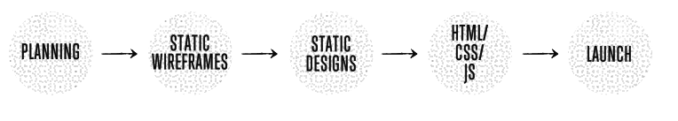
About three or four years ago—when I mostly did just static width sites—my projects went through the different phases in the order illustrated below, which looks like a typical waterfall process. Back then there wasn’t much room for revisions, and what clients saw were either the wireframes or almost finished Photoshop designs.
That model kind of used to work back then, but now there’s just one problem. Waterfall model doesn’t make that much sense when combined with responsive design. Actually it wasn’t ever very optimal way to do web design, but as I and everyone around me were so used to delivering things in that specific order we never really tried to challenge that.
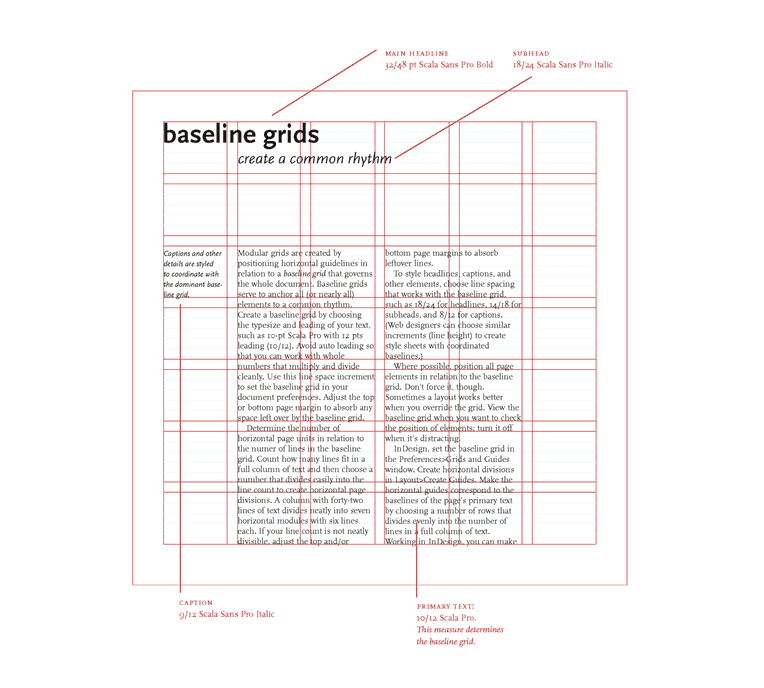
Couple months ago while I were designing a website I remembered a technique I had long forgotten. I used to use this technique before I moved from print design to web design about eight years ago and it was, for me, an essential way to utilize modular grids better. Grids in design are kind of like the scales in music. They give you a way to anchor your layout elements and typography to a certain rhythm.
A modular grid is a grid which has consistent horizontal divisions from top to bottom in addition to vertical divisions from left to right. Modular grids are created by positioning horizontal guidelines in relation to a baseline grid that governs the whole document. Baseline grids serve to anchor all (or nearly all) layout elements to a common rhythm. [1]
CSS is designed primarily to enable the separation of content from presentation, including elements such as the layout, colors, and fonts. This separation improves content accessibility and provides more flexibility and control over the presentation. CSS is quite flexible language on its own, but as websites become more and more complex we sometimes need to have more control.
I’m using Sass to extend the basic behavior of CSS and this post is mostly about some basic things I’m using. I’ll also assume that you know something about Sass already and that’s why I won’t dive deep into what it actually is. If you are running OS X, you can get Sass up and running using these two commands below. The first one installs Sass Ruby gem and the second one translates your .scss file into a .css file.