Prototyping Responsive Typography
The history of typography dates back about 5,000 years. It starts from a series of pictograms, which then evolved to hieroglyphs in Egypt and later around 1,200BC to Phoenician alphabets. Almost 2,500 years later the Chinese invented first movable type which later revolutionized everything in the west when Gutenberg invented latin movable type. Many of the basic concepts of typesetting are still the same as 500 years ago.
Web typography, and digital typography in general, is a huge step forward in this history. It has made setting type fast and easy compared with hand-setting metal type. Responsiveness, when added on top of this, makes this period of change we are living very fascinating. Not only is centuries old design theory being rewritten, but the process of how design happens is now changing too (as Mark Boulton states it).
When talking about “responsive typography,” I don’t just mean flexible body text, but also that all our decisions should be based on universality. Universality, as a design principle, should guide us when choosing web fonts and when testing how our type works on various devices and platforms. It should be the core principle behind all the work we do.
New Process #
About a year ago I wrote Responsive Workflow article describing my responsive design process. It was an article that gathered a lot of buzz, but I think it just scratched the surface a bit and never really tried to fully describe what’s happening behind the curtains. In this article I’m going to open the curtain and explain a new phase which I would today add to my year old workflow drawing. The new design phase is somewhere between prototyping and visual design phases, and I call it the “Typography Prototyping Phase.”
As I earlier in that article wrote, typography for the Web is really hard to design anywhere else than inside the browser. This is today even more true than it was a year ago. Typography prototype tries to solve this by doing the hard choices before jumping to other tools like Photoshop.
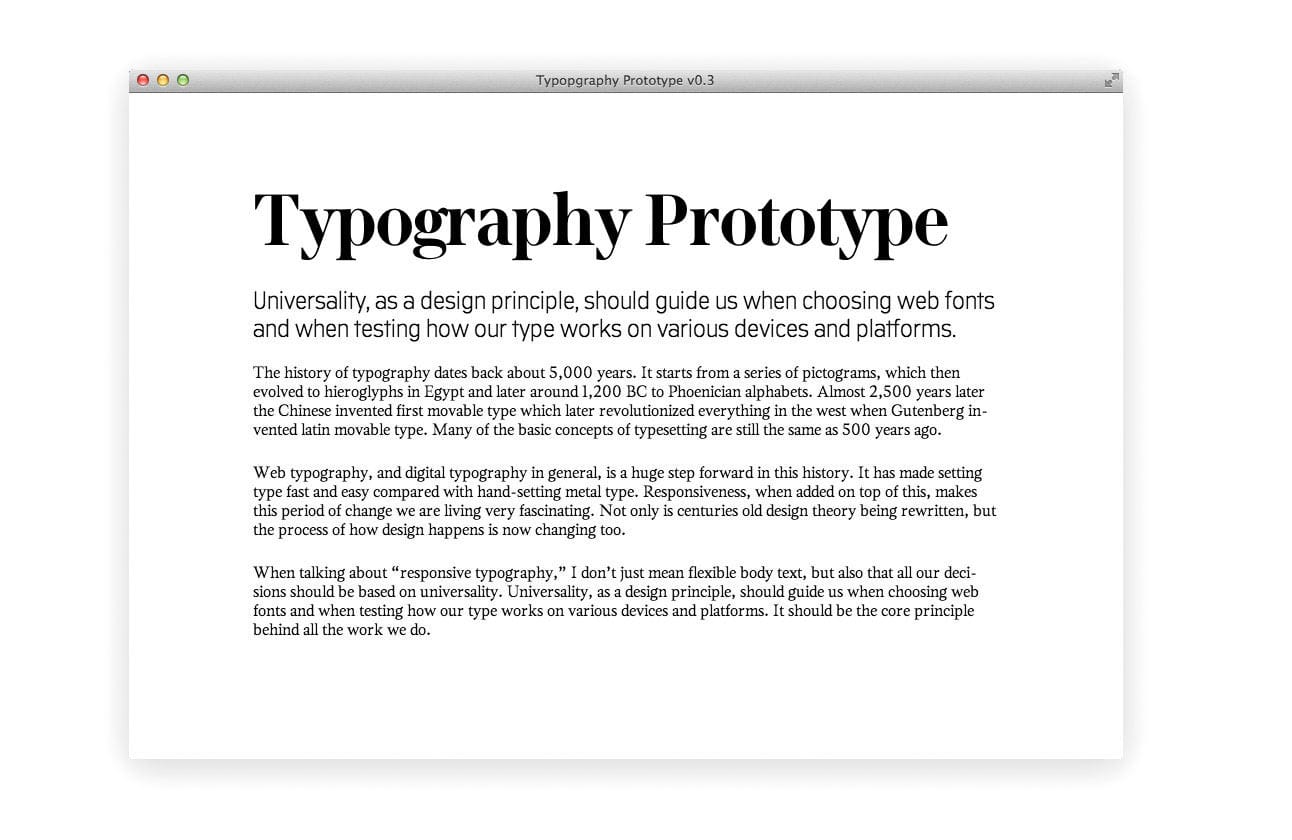
Basically, a typography prototype is a single web page that consists of the project’s actual content. It’s designed in the browser using real web fonts and tools like Typecast. A typography prototype includes font choices, styles for the basic text content and a typographic scale, but nothing else.
Content precedes design. Design in the absence of content is not design, it's decoration.”
– Jeffrey Zeldman
Planting the seed #
All our decisions should start from the content out, not canvas in. This means we shouldn’t start doing any design work before having the project’s actual content on hand (or something that is very near the actual content). That’s because the content and the language used has a big impact on how our typography will work. This is especially true with display type and headers, but also with paragraphs and line-lengths. Having the real content also helps to judge if the font choices fit the mood correctly.
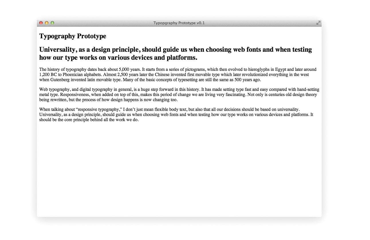
Below is an example of what the typography prototype looks like before any styles have been applied. This basic HTML page is already responsive on its own—by default, like Andy Hume states it, so you can immediately start testing how it works on various devices:
Choosing typefaces #
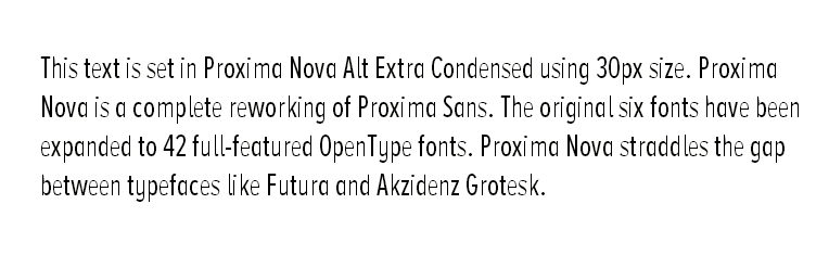
Choosing type combinations, which are legible and readable across multiple devices and operating systems isn’t easy. Windows XP, which still has relatively high usage percent globally (24.29% at the moment of writing), is notorious for its poor font rendering. By default it doesn’t have ClearType antialiasing on at all, except in IE8. Fonts which haven’t been properly hinted for use on screen, tend to look like this when viewed there:
When choosing typefaces for the Web you should look out for the following qualities: Style and form, How easy it is to read, typeface’s intended usage—is it meant for longform reading or is it a display type, it’s character set, file size, OpenType font features, how it renders on different screens and if it is hinted for screen or not. Some good tools which can help with the process are Web Font Specimen, Typecast app and Typekit’s font browser.
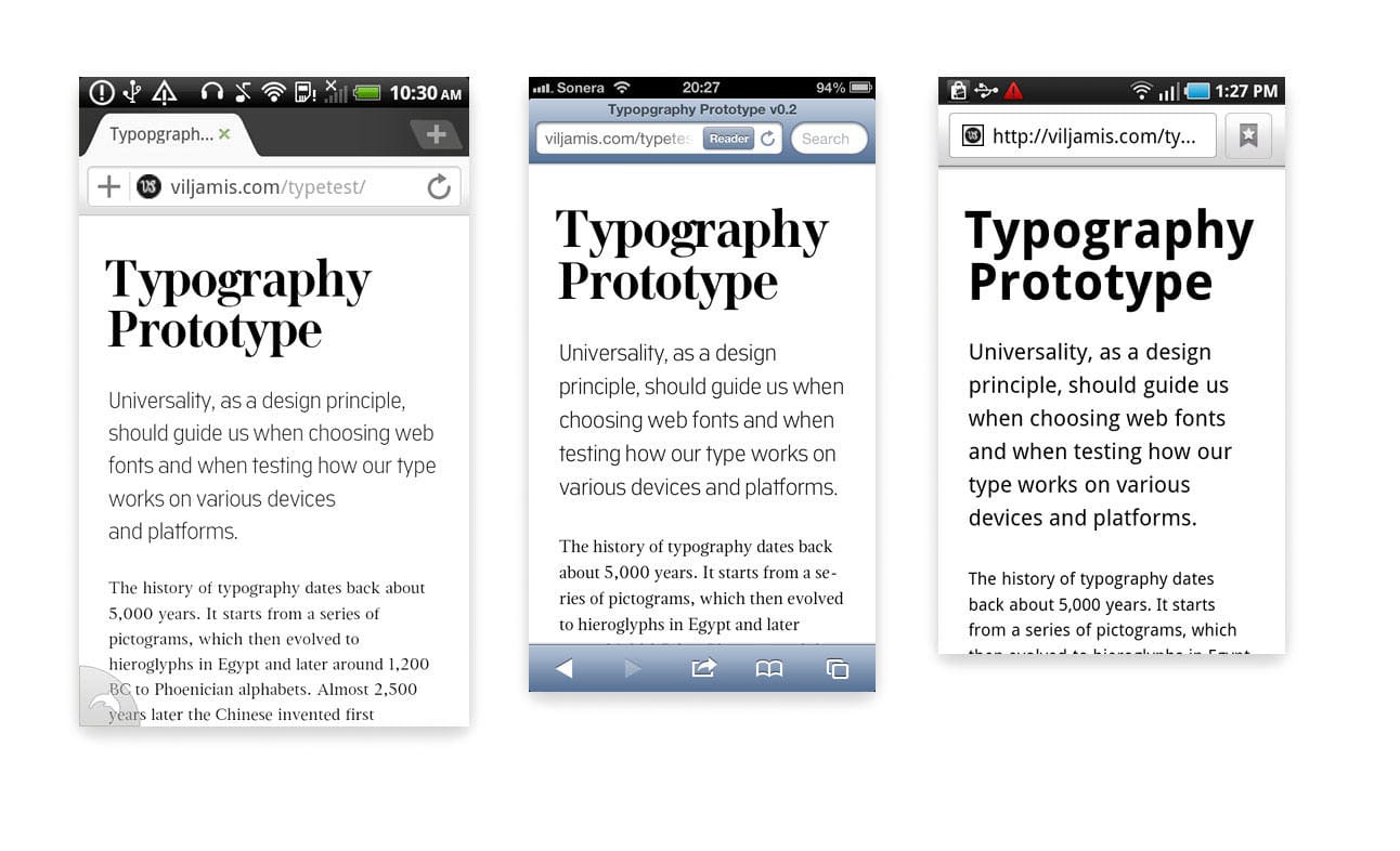
It’s important that we choose the typefaces before making any other decisions about the layout. This way we can later on determine what the optimal font sizes are for the project, based on how the selected typefaces render at different sizes. Below is an example of what the typography prototype looks like on various platforms after the typefaces have been picked and we start testing how they actually render:
Useful Resources:
- Thinking with type: Mixing Typefaces
- @font-face Support on Mobile and Tablet
- Default system fonts across different mobile platforms
- Typekit: Good for longform reading
- Fontdeck: Hand hinted fonts
Choosing a scale #
A scale, or more precisely, a modular scale, is a sequence of numbers that relate to one another in a meaningful way. A modular scale helps us to choose font sizes, line heights, margins, and more. Modular scales also make it easier to achieve a visual harmony in the whole design.
I recommend calculating typographic scales using the ideal text size of the chosen body typeface + a ratio, which could for example be the Golden Ratio 1:1.618. I tend to use either Tim Brown’s Modular Scale Calculator to build a custom scale, or, if the sizes match, the scale described in my previous typography article:
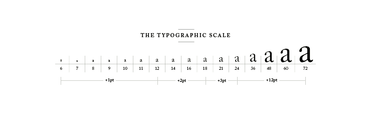
Tim, who also made the calculator I just mentioned, has written an in-depth guide about modular scales and how to use them on the Web. Tim’s methods are very similar to the ones I use myself too, and this is a short excerpt from his article:
Sizing type on the web is tricky because of the limited resolution involved. One pixel of font-size up or down can completely change how a typeface—and thus a whole text—looks. But once I found the size I liked, 18px, I had a number upon which to base my modular scale.”
Sizing type #
There are no absolute sizes when it comes to measuring web type. Everything is relative. That’s why you should avoid using absolute values like pixels and instead embrace the fluid nature of the Web using units like percents and EMs. The size of the type you should use depends on the reading distance, device’s resolution and the typeface used. Reading distance also varies depending on the device used—is it a device held in hand, is it a tablet or is it a desktop device? Or maybe it’s something in between these?
A good starting point is to set the body font-size initially to 100%, which zeroes our scales to the “normal” of a given environment and then design and build for larger screens from that point upwards by using the modular scale we calculated earlier.
I do this by using a function in Sass which automatically converts pixels to EMs so that I don’t have to manually calculate them. The function below works by taking two arguments, pixels and context. You can either use the default context and specify only the pixels you want to convert—or you can specify pixels and a context for the conversion:
$browser-context: 16; // Default

@function em($pixels, $context: $browser-context) {
  @return #{$pixels/$context}em
}
…and then later in the CSS we can just pick numbers from the scale, 16/24/72, and they get automatically converted to EMs:
body {
  font-size: em(16);
}

p.intro {
  font-size: em(24);
}

h1 {
  font-size: em(72);
}
Below is an example of what the typography prototype looks like now, when we have our scale and have applied some base font sizes from that, but haven’t really tweaked the leading or margins at all:
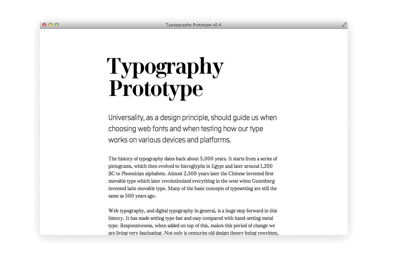
Leading and white space #
Leading (line-height in CSS) is the vertical distance between baselines of two lines of text. Leading has a big impact on the readability of a paragraph, so we should be careful when adjusting it. We should use tighter leading in a narrower paragraph, and looser in a wider one. This is to aid the readability and can be achieved by changing the line-height inside our media queries, or by using Mat Marquis’s plugin called Molten Leading.
High DPI screens add some extra complexity as they tend to require different line-heights than the lower DPI screens. Joni Korpi thinks this is because the text looks visually thinner with the extra pixels in use. Less weight = less line height needed.
In the example below, I’ve adjusted the leading of the header, paragraphs, margins, and also the line lengths to be more comfortable to the eye. Everything is based on the numbers found from the scale I created earlier. The example you see here is now basically a ready typography prototype which can be used as the base for the rest of our work:
Additional Tips #
Screens with different pixel densities require different grades of the same font, just like different papers in print do. In theory, this is a great idea, but in reality, there aren’t that many fonts which would have grades (and hardly any have been designed for screen use). Newspapers have been using graded fonts for different papers for a long time, but it’s a quite new concept on the Web.
Sometimes using different body fonts for different screen types is better than using the same font all the way. A List Apart’s new redesign is experimenting with this idea. They are using Georgia Pro Condensed in the smallest breakpoint, to see if layouts are enhanced by fitting in more characters per line.
If needed, use non-breaking spaces between last two words to avoid orphans in fluid paragraphs ( ).
Always use non-breaking spaces in expressions in which figures and abbreviations are separated by a space (e.g. 20 kg, 4:00 pm) and where text breaking across two lines might be disruptive to the reader.
Try to keep the line length between 45-75 characters per line.
Conclusion #
The finished typography prototype will be used as the foundation for the rest of our work. We have the recipe, and now we need to start thinking how the colours and the layout will be cooked. This way, when we start our work from the most crucial parts—the content and the typography—and build everything else up from that point, there’s much less chance that we will get lost along the way. ❦
