On Typography
I have been intrigued by the idea of making a typographic scale out of a musical scale that would not only be very readable, but also aesthetically pleasing. This whole idea started after the launch of my new site. At first, I ignored to see it, but weeks later I started to notice that the textual content of the site is actually pretty harsh for the eyes and the reading experience isn’t that great.
You can read it—I’m quite sure of that—but the longer you browse the content, the more your eyes start to hurt. Literally. One reason for this is the contrast between the text and the background, but there’s also more to it than just that, so I started wondering:
- How could I improve it?
- How to make building of responsive typography easier?
- Can typography look good and be readable on so wide range of devices?
- Are there any patterns where I could base my decisions on?
The foundation #
At the time I were thinking about the subject, I had a Skype chat open with Joni Korpi and we were discussing about similar problems in Responsive Design. Later on the evening, when I had already went to sleep, Joni pasted me a link to 24 Ways article about Music, Harmony and Proportion in Web Design. The idea didn’t hit me instantly after I read it, but about a week or two later I was hooked and started studying how Musical Scales could help me to make the perfect Typographic Scale for the Web.
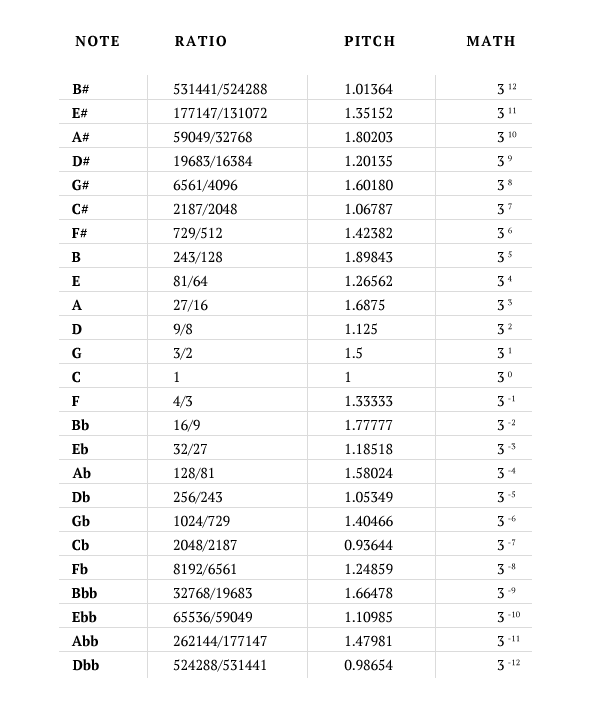
Since I’ve been following close-by music producers and artists—who compose their tracks with the help of a scale—for most of my youth, I felt pretty confident to base the rhythm and proportions on the chromatic scale. There are different versions of the scale and I decided to go with the Pythagorean one. That decision was mostly based on the information I could find from the Web.
The Chromatic Scale #
The chromatic scale is a musical scale with twelve pitches, each a semitone apart. On a modern piano or other equal-tempered instrument, all the half steps are the same size. An equal tempered chromatic scale is a non-diatonic scale having no tonic because of the symmetry of its equally spaced tones.[1]
The most common conception of the chromatic scale before the 13th century was the Pythagorean chromatic scale. Due to a different tuning technique, the twelve semitones in this scale have two slightly different sizes. Thus, the scale is not perfectly symmetric. Many other tuning systems, developed in the ensuing centuries, share a similar asymmetry.[2]
Different notes and their Ratio/Pitch/Math: #
Don’t compose without a scale #
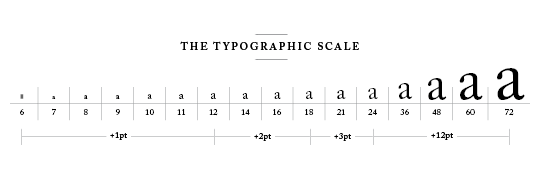
In the sixteenth century, a series of common sizes developed among European typographers, and the series survived with little change and few additions for 400 years. [...] Use the old familiar scale, or use new scales of your own devising, but limit yourself, at first, to a modest set of distinct and related intervals.” [3]
That’s an excerpt from a book called The Elements of Typographic Style by Robert Bringhurst. Basically, the use of a scale in typography is something that have been practised for centuries. It’s not something that I just invented. Today you can see it, for example, in all word processing applications that let you choose font-size or change line-height.
At this point, you might want to ask why did I even want to build a new scale if there’s a scale that have been used for centuries? How could I possibly build a better one?
The short answer: I never believed that I could do it better, but I wanted to learn more in-depth what is the foundation of good typography. I’ve always felt that typography is the most crucial part of a design and also the hardest thing to master.
Composing the layout #
The first thing I did, is that I forgot pixels and started using EMs for everything. That’s because they give a lot more control for scaling and making the typography responsive. The chromatic scale is also easy to convert to EMs, so there are many arguments to support this decision.
What I basically did first, is that I started testing different combinations and notes that play well together and started adding some calculations to the mix. After about a week of testing the results were quite interesting: No matter what combinations I used, I always ended up having a scale that’s very similar to the centuries old Typographic Scale described in Alex Charchar’s article.
That only covered the various font sizes though, but I added a 1.5em baseline grid into the mix and with the help of that calculated optimal white space needed for the headings, paragraphs and other elements.
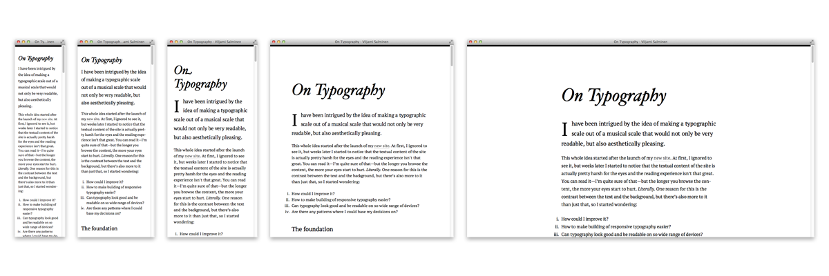
The result of all this is the page you are reading right now. It’s using the same “foundation” which I’m going to share later on in this article. If you are eager, then go ahead and grab a copy of it from GitHub and tweak/use it in any way you want. It might not be perfect yet, probably never will, but if it works for you I’m more than happy to share it.
About the responsiveness #
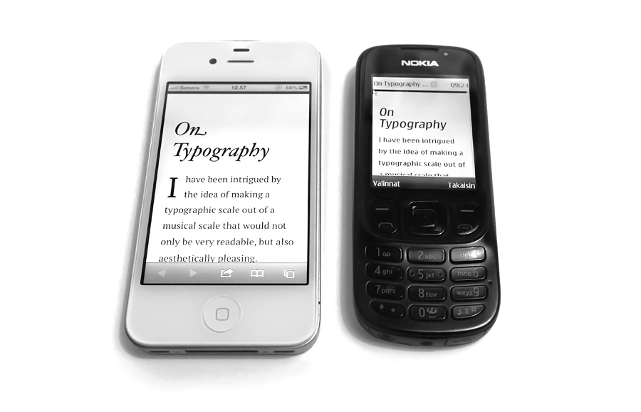
I started with a mobile first approach and wanted to make sure that the content preserves it’s readability from about 200px and up. So not only smartphones, but also feature phones that have slightly smaller screens.
The interesting thing for me is, that the more I build responsive sites, the more the current way of building them feels complex and hard. I can, for example, choose to make a completely fluid layout or a set of static layouts. Or take a mixed approach that has both fluid and fixed widths (but this isn’t really the hard part yet).
There’s also often a lot of “magic” happening inside various Media Queries and we tend (or tended) to think more device widths than what the layout can handle. Things get also interesting when you are building a site that runs on top of a CMS where your client does all the updating and even more so when you start adding advertising and dynamic content into the mix.
I tried to leave all these problems aside when thinking this, but I really couldn’t. The way which I might see myself working in the future is probably somehow based on the way how this template is built. It basically has only one one column layout which just scales up or down. Then the next layout after that—when the screen size is big enough—could be the more complex one, which includes more columns and “richer” experience (isn’t included in this template). So that’s two different fluid/fixed/mixed layouts which we can then scale up or down to create even more responsiveness.
The thing which I kind of like in this approach, is that I’d only have to build one layout for the mobile and one for the desktop and anything in between (or bigger) would just scale. I know that there are more things to consider than just that, but if I could get going with only minimal CSS changes between the Media Queries, let’s say, only the body’s font-size, max-width and maybe some padding, that would be wonderful.
Final layout #
Below is the base CSS for the template I came up with. Different CSS declarations are explained below the code.
BTW: If you are using Firefox/Safari/Chrome to read this, and want to see the whole layout in effect, I suggest you to try Safari and install Resizer Extension so that you can see the narrowest layouts with your desktop browser (also a handy tool when building sites).
body {
  font: 75%/1.5em Georgia, serif;
  max-width: 40.49984em;
  color: rgb(0,0,0);
  margin: 0 auto;
  padding: 1em;
}

@media print {
  /* styles for print */
}

@media screen and (min-width: 15.652em) {
  body {
    font-size: 87.5%;
  }
}

@media screen and (min-width: 19.9375em) {
  body {
    font-size: 100%;
    padding: 1.5em;
  }
}

@media screen and (min-width: 29.9375em) {
  body {
    max-width: 34.3em;
    padding: 1.5em 3em;
  }
}

@media screen and (min-width: 38em) {
  body {
    padding: 4.5em 3em 7.59372em;
  }
}

@media screen and (min-width: 99.9375em) {
  body {
    max-width: 34.43736em;
    line-height: 1.75em;
    font-size: 112.5%;
  }
}
CSS in short: the first layout for feature phones is using 12px base font-size and the max-width and horizontal centering are there for browsers that don’t support Media Queries. Then inside next Media Queries the whole layout starts to scale slightly bigger just by changing the body’s font-size. This works because EMs are always relative to parent element’s font-size and I’m using EMs everywhere instead of pixels.
Simple yet effective. ❦
Get the code #
- Point your browser to the GitHub project page.
- Read my newer blog post about the subject: Scaling with EM units.
- If you have questions send me a tweet.
References and links #
First and foremost, I should thank Iain Lamb for his exploration of scale and rhythm in typography. He was the one that gave me the idea to base my decisions on the Chromatic Scale. I should also thank Alex Charchar for his article about Typographic Scale.
Then there is the 24 Ways article which I mentioned earlier, where it all kind of started: Music, Harmony, Proportion in Web Design.
[1] Benward & Saker (2003). Music: In Theory and Practice, Vol. I. Seventh Edition. ISBN 978-0072942620.
[2] Excerpt from a Wikipedia article about the Chromatic Scale.
[3] Bringhurst, Robert (2003). The Elements of Typographic Style. Third edition. ISBN 978-0881792065.
