Typography for User Interfaces
Back in 2004, when I had just started my career, sIFR was the hottest thing out there. It was developed by Shaun Inman and it embedded custom fonts in a small Flash movie, which could be utilized with a little bit of JavaScript and CSS. At the time, it was basically the only way to use custom fonts in browsers like Firefox or Safari. The fact that this technique relied on Flash soon made it obsolete, with the release of the iPhone (without flash) in 2007.
In 2008, browsers started eventually supporting the new CSS3 @font-face rule. It had already been a part of the CSS spec in 1998, but later got pulled out of it. I remember the excitement when I managed to convince one of our clients to utilize the new @font-face and rely on progressive enhancement to deliver an enhanced experience for browsers which already supported this feature.
Since my early days in the industry, I’ve grown to love type and all the little nuances that go into setting it. In this article, I want to share some of the fundamentals that I’ve learned, and hopefully help you get better at setting type for user interfaces.
The first GUIs #
While the history of typography dates back about five thousand years, we’ve had graphical user interfaces for mere four decades. One of the key turning points was in 1973, when Xerox introduced Alto, which in essence created the foundation for today’s graphical UIs. Alto was born a decade before any other GUI hit the mass market, and was seen as the future of computing.
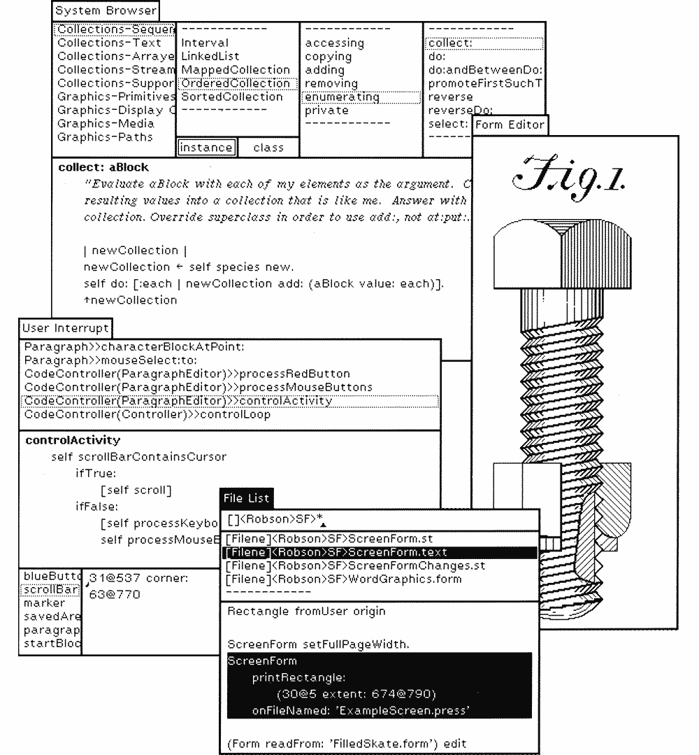
This early development for Alto evolved to Xerox Star in the 80s and became the first commercial operating system with GUI.
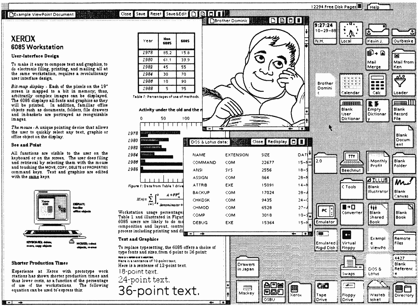
Although neither Alto nor Star never really took off the ground, they greatly influenced the future development at Apple and Microsoft with their revolutionary mouse-driven GUI. A couple years later, in 1984, Steve Jobs introduced the first Mac OS.
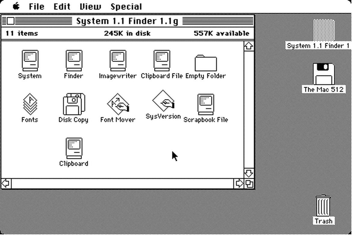
The release of the Macintosh meant custom typography suddenly becoming available to the masses for the first time ever. The original Mac came pre-installed with many iconic typefaces, and over the next few years, multiple type foundries started releasing more and more digital versions of their popular typefaces.
When inspecting these early graphical user interfaces closer, we realize that most of their elements are written language. These GUIs are essentially pure text — collections of singular words displayed in isolation from one another.
We can make a similar observation by inspecting almost any modern interface too. Our interfaces are written, text being the interface, and typography being our main discipline.
Text is interface #
Every word and letter in an interface matters. Good writing is good design. Text is ultimately interface, and it’s us, the designers, who are the copywriters shaping this information.
Take a look at the example below and imagine the elements taken apart and put down on a table in front of you. Observe what’s left. A collection of singular words, two images and few icons.
Our work is not about putting random things on screen and making them look pretty, but instead starting from the most important parts, the copy and the content, and figuring other details up from there. That’s where the core of our craft lies.
The clarity of letterforms plays a key role too. It might not seem to matter much at first, especially if our brain needs to pause only for a fraction of a second to decipher a word shape. But when we multiply this across numerous instances and letter combinations, our typographic choices become much more apparent.
Of course, there are more nuances to interface design; things like balance, positioning, hierarchy and structure, but good copywriting and typography takes us 95% there.
A great designer knows how to work with text not just as content, he treats text as a user interface.”
– Oliver Reichenstein
How we read #
If the letters that we put on screens are so important, then we should spend some time studying how we read and how that affects our design decisions.
One of the key findings that I had back when I was reading Billy Whited’s article on Setting Type for User Interfaces, is that the efficiency with which we read is a function of the amount of text available to us as we do so. This means that an isolated word that has fewer than 20 characters will be read more slowly than a word that forms a part of a longer sentence.
This results from the fact that our eyes don’t move smoothly across the text when we read longer sentences. Instead, they make discrete jumps between words, which are called saccades.

Saccades improve our reading capabilities and make it possible for us to skip shorter functional words completely. This is a key factor to keep in mind since our interfaces tend to have mostly isolated words. In essence, it means that we cannot rely on the effects of saccades at all.
Eventually, knowing that the identification of individual letters plays the most critical part in the reading process, it’s becoming apparent why our choice of typeface is extremely important.

In the past, many thought we recognize words by their so called Bouma shape, or the outline that a word creates. In later studies this was proven to be somewhat wrong, and the readability and legibility of a given typeface should not be anymore evaluated only by its ability to generate a good bouma shape. Instead, we need to pay more attention to the letterforms themselves.
What makes letters legible? #
At first, it might seem hard or just plain impossible to answer this question. Since reading is a matter of habit, we read best, what we read most. How could we possibly determine what features make letters legible? To start gaining an understanding, we need to first break sentences into words, words into letters, and letters into smaller parts and start looking the finer details.
In 2008, Department of Psychology at the University of Victoria did empirical tests to reveal which areas of lowercase and uppercase Latin letters are most efficient for reading.
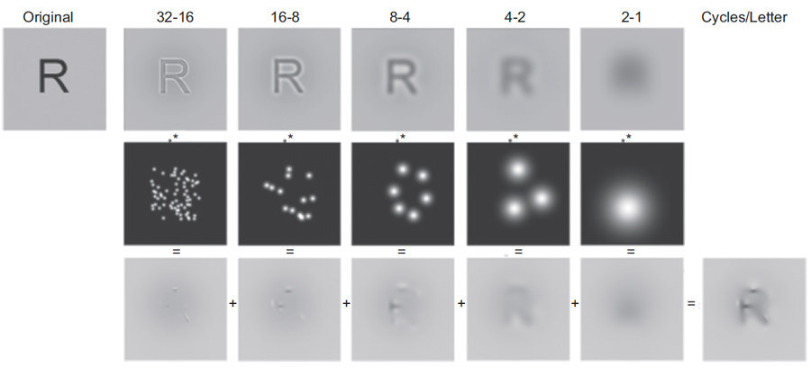
The study revealed a few interesting things. First of all, it revealed that line terminations are the most important features for letter identification.
The image above shows which areas we pay most attention to when recognizing letters. These areas of a typeface should be designed both in a generic and familiar way and also in a way that stresses letter differentiation.
In 2010, there was also another study, by Sofie Beier and Kevin Larson, that focused testing letter variations of frequently misrecognized letters.
This study found that some variations were more legible than others, despite the letters within a font having similar size, weight and personality. The results showed that narrow letters benefit from being widened, and that x-height characters benefit from using more of the ascending and descending area.
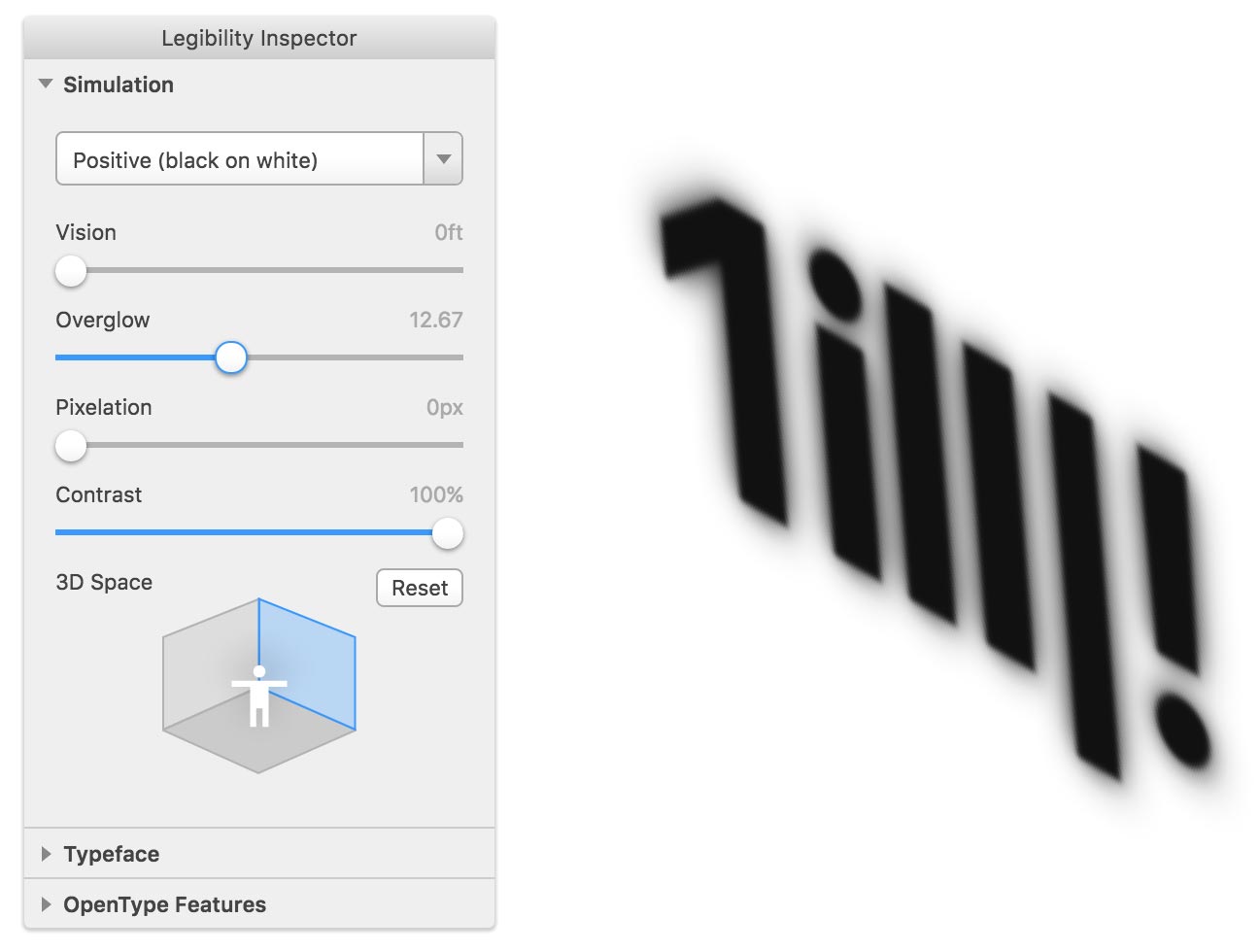
We can gain more understanding about the legibility of a given typeface by using a tool I built for a recent project. Legibility App allows you to simulate different (often harsh) viewing conditions by applying a level of filters on top of the text — like blur, overglow and pixelation. The app is in beta, and for the time being, works in Chrome, Opera and Safari.
What to look for in a UI typeface? #
Understanding how we read and what features make letters legible gives us a better overall view on what we should look for when choosing a UI typeface. I’ve gathered 10 key things below.
1. Legibility #
Legibility is the number one factor to consider. Letterforms need to be clear and recognizable. Letters with clear distinction in their forms perform better as user interface elements.[5] Many sans serif typefaces, including Helvetica, have indistinguishable capital I and lowercase l, making these particular fonts bad choices for interfaces.

Source Sans Pro on the left compared to Helvetica on the right. It’s almost impossible to differentiate the first 3 letters on Helvetica. Source Sans Pro on the other hand performs much better. Some people would also agree that Helvetica sucks for any type of UI work since it wasn’t really developed for use on screen displays.
Helvetica sucks. It really wasn’t designed for small sizes on screens. Words like ‘milliliter’ can be very difficult to decipher.”
– Erik Spiekermann
When Apple “momentarily” switched to using Helvetica as their main interface typeface, it caused real usability and readability issues for certain users. Eventually, this was one of the reasons that led Apple to design the typeface we now know as San Francisco. This new typeface is designed specifically for screens and it has higher x-height than Helvetica, looser spacing, and its letters are easier to distinguish from one another.
 Image credit: Thomas Byttebier
2. Modesty #
An ideal UI typeface doesn’t scream for attention, but rather goes unnoticed. The typeface you choose should stay out of the users’ way when they try to complete their task, by honoring the content in a way that doesn’t add to the users’ cognitive load.

3. Flexibility #
A UI typeface needs to be flexible. We are designing experiences for medium(s), where it’s not possible to control our user’s abilities, context, browser, screen size, connection speed, or even the input method used.
The typeface we choose should support these vast contexts and work well in different sizes, devices, and on a small screen in particular. Sans serifs that are made to work at small sizes on low resolution are preferred.[5]

4. Large x-height #
X-height means the height of a lowercase “x”. You want to look out for a typeface with large x-height since it’s in general easier to read and renders better in small sizes. Don’t go too far though, since too large x-height makes the letters n and h difficult to distinguish.

5. Wide proportions #
Proportions refer to the width of a character in relation to its height. You want to look out for a typeface with wide proportions since it helps with legibility and is easier to read in small sizes on a screen.
 Image credit: Adobe Acumin
6. Loose letter spacing #
The space around the letters is as important as the space within them. Letters that are too close to each other can be hard to read. A good UI typeface should have enough breathing room in-between letters, and even spacing to establish a steady rhythm.
On the other hand, if there’s too much spacing, the integrity of the word breaks. A good rule of thumb is that letter space should be slightly smaller than the counter space inside the letterforms.

7. Low stroke contrast #
Good UI typefaces have low stroke contrast. Typefaces with high-contrast might look good at larger sizes, but at small sizes on a screen thin strokes easily disappear. On the other end of the spectrum, we have typefaces like Arial and Helvetica, that can have too little contrast between letter shapes, making the letters indistinguishable from each other.
It’s all about finding a balance between the two. Imagine the example below as a horizontal scale. You want to aim for something that is more towards the example on the right side.

8. OpenType features #
Making sure that the typeface you choose supports OpenType features is important, since it provides much more flexibility for us. It’s often also an indicator that there’s a good support for different languages and special characters.
For me, one of the most useful OpenType Features has been tabular figures, which are numerals that share a common width. You might want to use them for example when working with timers or counters, or when you have a table displaying information like IP numbers.
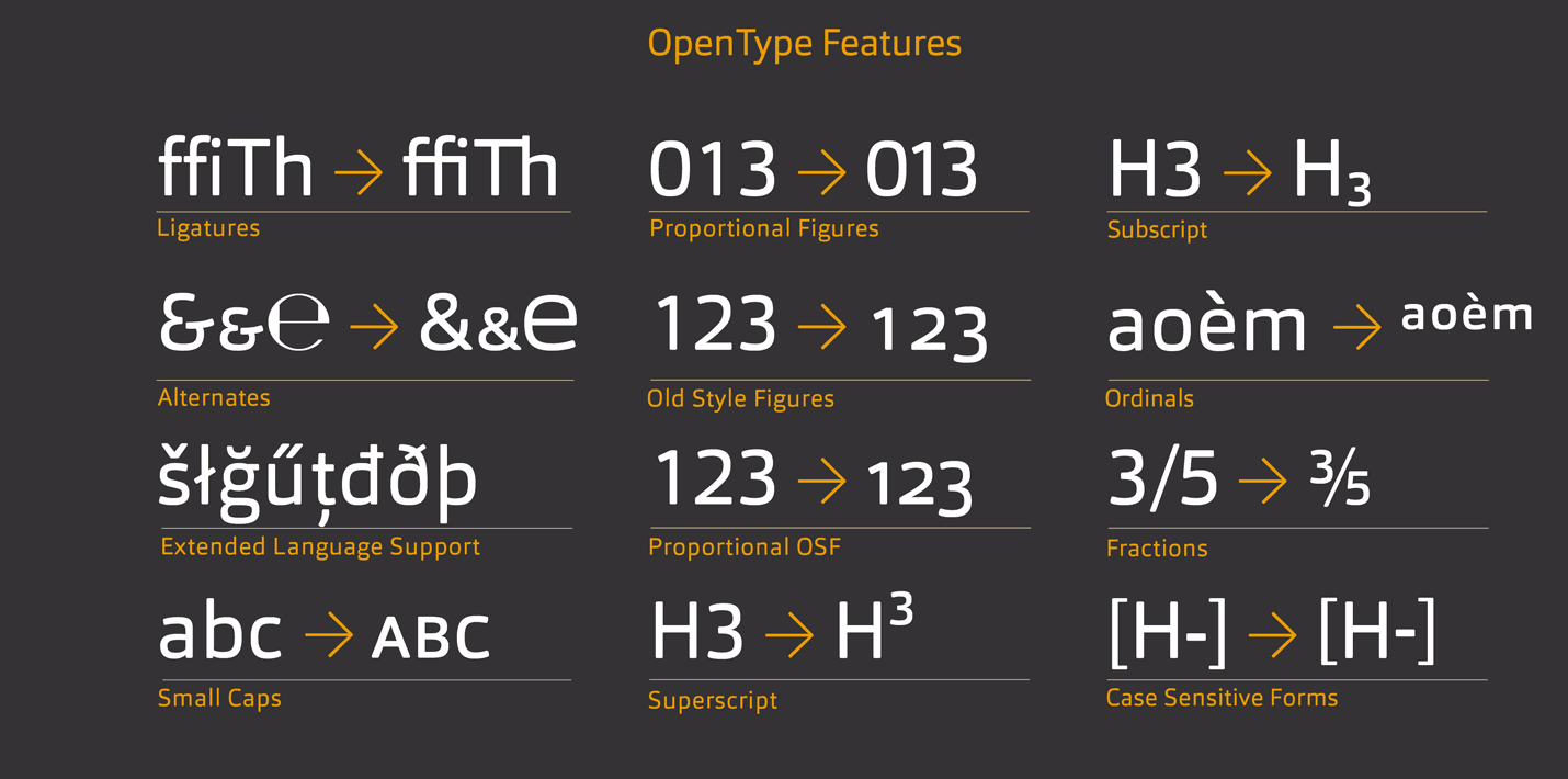 Image credit: Fontblog
9. Fallback fonts #
Below is an experience that you’re all probably familiar with. What’s happening here is that the web fonts are blocking the actual content from showing up before they’re all fully loaded.
 Image credit: Filament Group
This can be easily fixed by loading the fonts in a non-blocking manner, which drastically cuts the loading time for the content. The drawback is that we need to define fallback fonts from the default system fonts, which show while our custom fonts are loading.
 Image credit: Filament Group
10. Hinting #
Hinting is a process where fonts are adjusted for maximum readability on computer monitors. Hinting tries to make vector curves render nicely to a grid of pixels by providing a set of guidelines for different sizes. At low screen resolutions hinting is critical for producing clear, legible text.
Windows is notorious for its bad font rendering without hinting, so make sure to always test on a Windows device that has low DPI monitor connected to it. This helps you to ensure that the letter forms stay legible.
 Image credit: Typotheque
The Future(s)
It’s been a relatively short ride for us, and I expect to see a lot of progress in terms of how type behaves on the web, how our typographic tools mature, how font formats keep evolving, and how we’ll be utilizing type in the (near) future.
I imagine we’ll start seeing much more progressively enhanced experiences where the text itself is fundamentally more important than our suggestions about how it should be typeset.[6] It’s really how things have always worked on the web, but we’re only now starting to take this issue seriously.
For ideal typography, we also have to know as much as possible about each user’s reading environment. This may seem obvious, but it really isn’t.[7] In the future though, I imagine typefaces becoming more aware of their surroundings and starting to respond to a number of factors like viewport, resolution, type rendering engine used, ambient light, screen brightness and even the viewing distance.
I also predict that fonts’ legibility adjustments will be eventually linked to OS’s accessibility options so that typefaces can automatically start adapting to different user needs.
Overall, I see the future for UI typography being all about sensors and font formats that can respond to data acquired from these sensors, and eventually also new typographic tools that have contextual awareness which integrates more intelligent algorithms to our workflows.
All this is needed so that we, and the typefaces that we work with, can better respond to all these contexts we have to deal with.
 Image credit: Luke Wroblewski
To ease our work…
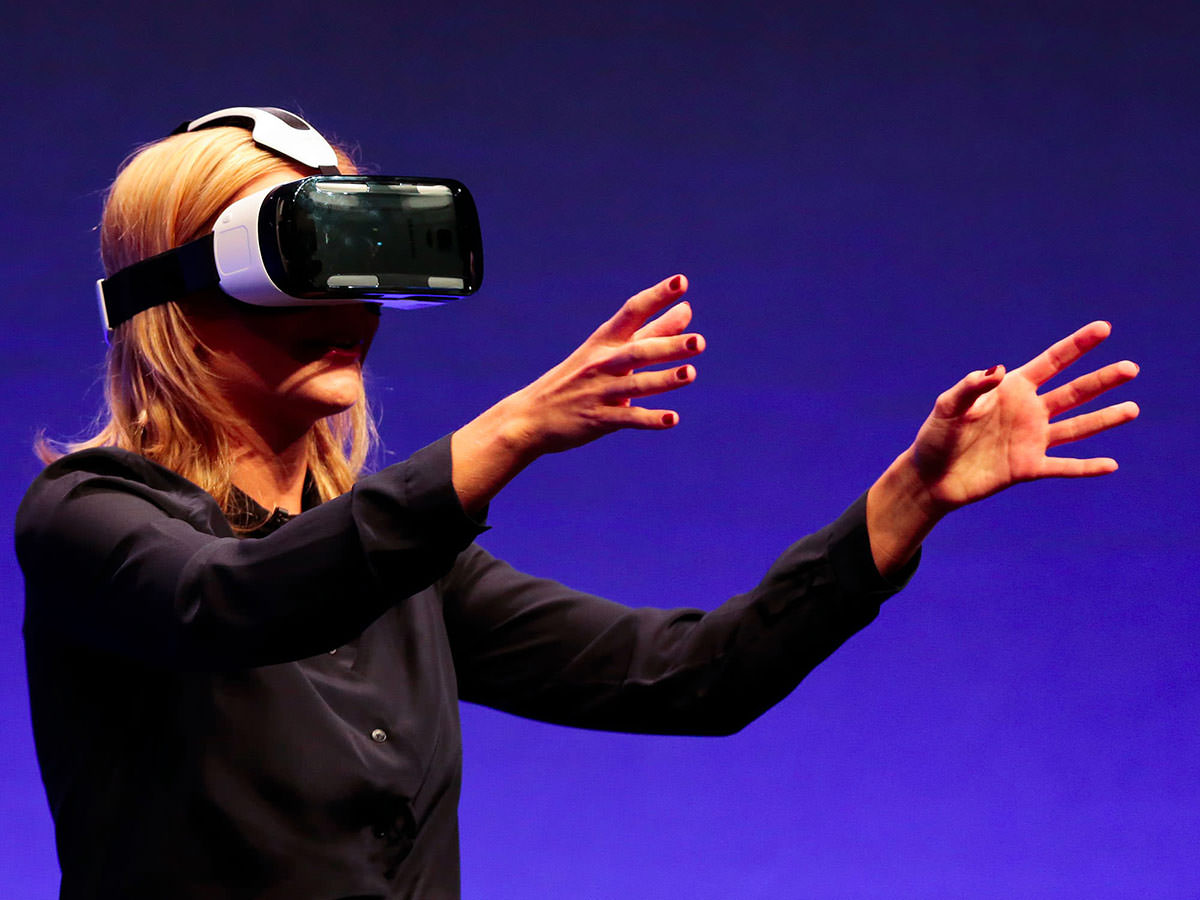 Image credit: Samsung GearVR
…make our interfaces faster…
 Image credit: MozVR
…more accessible…
 Image credit: Callan & Co
…and eventually more legible and productive too…
 Image credit: Microsoft Hololens
…because ultimately, good typography enables productivity for everyone. It could even save your life. ❦
This article is loosely based on a talk that I did in one of our internal design workshops at Idean in Palo Alto, CA. See the slide deck.
Likes (27)


")

")

Reposts (14)


