Launching Nord Design System
We’re excited to announce the first major release of Nord Design System, v1.0. With this release, our design systems team is shipping a number of new tools and features to improve the experience of designing, building, and shipping products at Nordhealth.
Looking back in time, we started our design systems journey at the end of 2020 with initial user research, but the concrete design and development work on the system didn’t start before the late summer 2021 when Eric Habich, Nick Williams, and David Darnes joined the team.
Now, 8 months later, I’m excited that we’re launching Nord Design System and all of our tools for production usage! To learn more about the new features included, keep reading below. 🎉
New Packages #
Nord Design System is divided into 7 npm packages and a Figma Toolkit. All of the packages can be used together or separately depending on the product team’s needs and often developers might install several of them in order to use Nord Design System, including:
@nordhealth/components@nordhealth/react@nordhealth/tokens@nordhealth/themes@nordhealth/css@nordhealth/icons@nordhealth/fonts
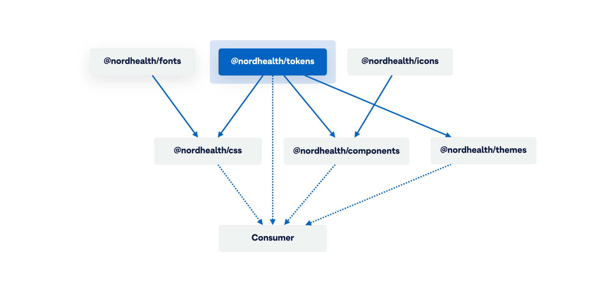
Figma Toolkit #
Nord’s Figma Toolkit is a resource for exploration and collaboration. It contains the building blocks for designing with Nord. Our goal was to create a toolkit that anyone at Nordhealth could use to prototype ideas. We’ve written more about the toolkit and our thinking behind it in one of our monthly updates.
Our plan is to open source parts of the library in the Figma Community soon so that anyone can learn how we use Figma and benefit from the work we’re doing. Take a sneak peek of our Figma Community page to follow us and stay up to date on what we’ll publish there.
Theming #
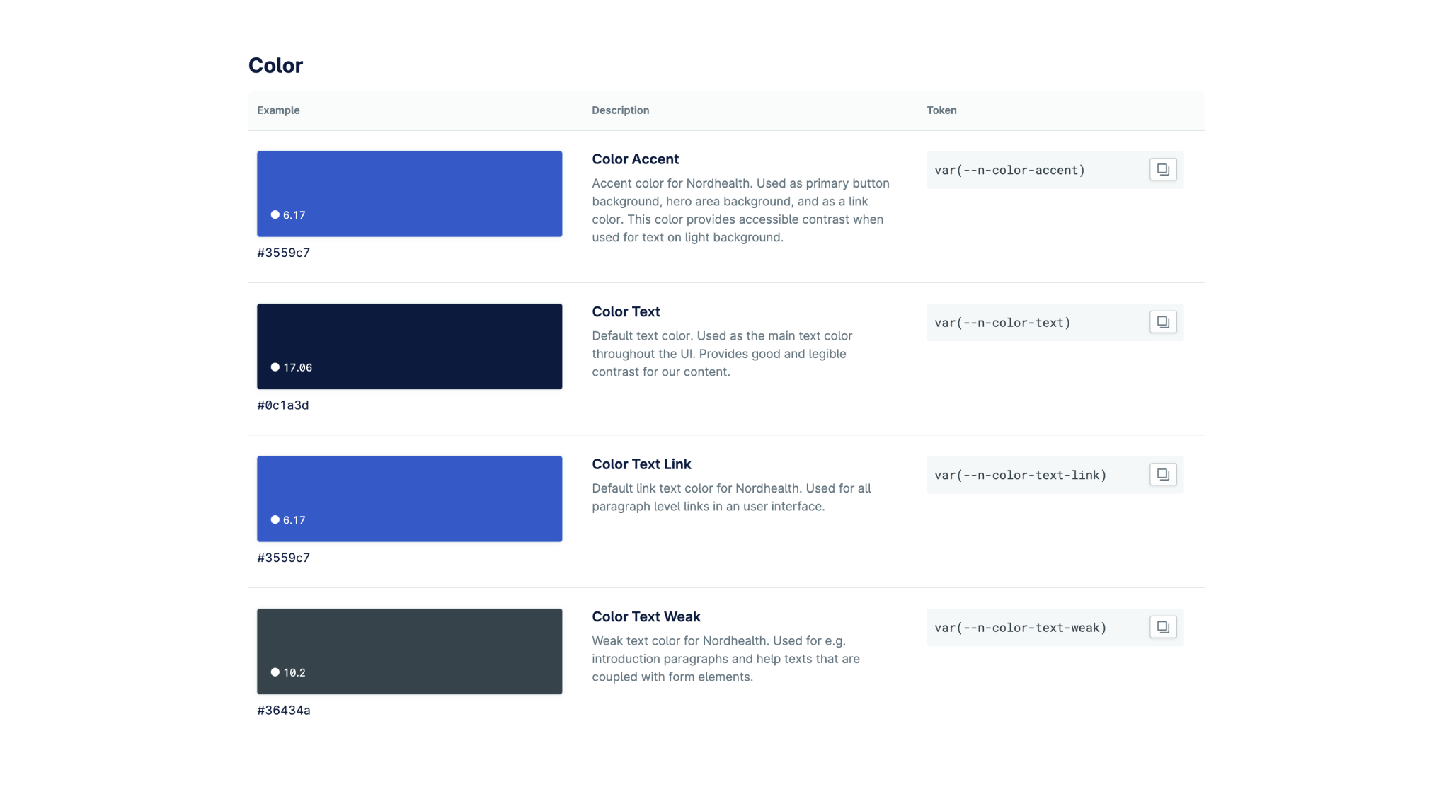
Nord uses CSS Custom Properties (sometimes referred to as CSS variables) to make its parts themable. CSS Custom Properties allow us to have our values stored in one place, then referenced in multiple other places.
A single theme in Nord is basically a plain CSS file which contains a :root CSS pseudo-class which declares global colors, gradients, box-shadows, and color aliases for the theme. Themes are usually referenced after our CSS Framework in the <head> of an application:
:root {
/* ACCENT COLOR */
--n-color-accent: {color};
/* TEXT COLORS */
--n-color-text: {color};
--n-color-text-link: {color};
--n-color-text-weak: {color};
--n-color-text-weaker: {color};
--n-color-text-weakest: {color};
--n-color-text-on-accent: {color};
--n-color-text-error: {color};
--n-color-text-success: {color};
/* NAVIGATION COLORS */
--n-color-nav-surface: {color};
--n-color-nav-heading: {color};
--n-color-nav-hover: {color};
/* BORDER COLORS */
--n-color-border: {color};
--n-color-border-strong: {color};
/* SKIN COLORS */
--n-color-surface: {color};
--n-color-background: {color};
--n-color-surface-raised: {color};
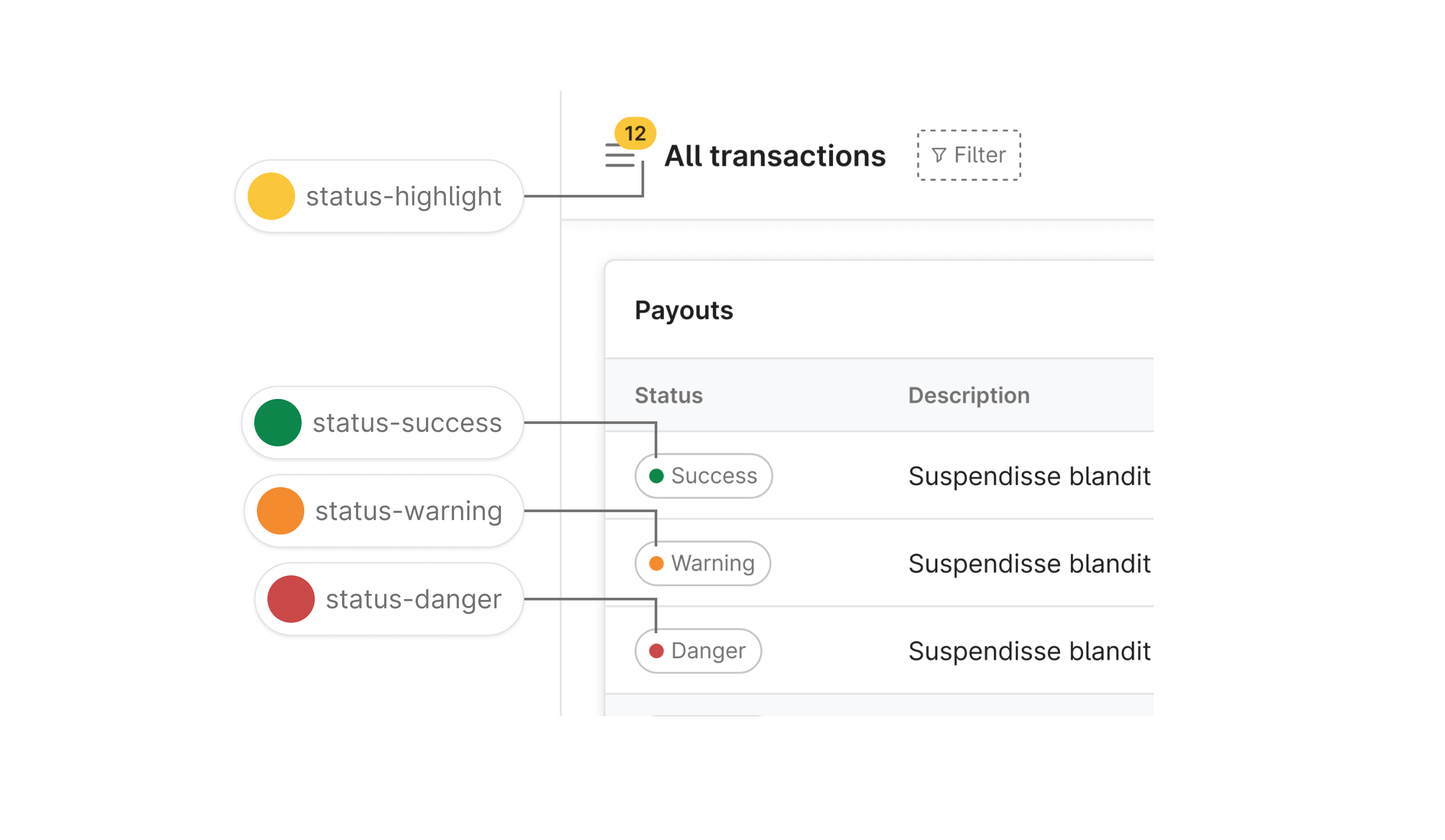
/* STATUS COLORS */
--n-color-status-warning: {color};
--n-color-status-highlight: {color};
--n-color-status-danger: {color};
--n-color-status-success: {color};
--n-color-status-info: {color};
/* ETC… */
}Nord’s theming also comes with a concept called Accent color which allows developers to provide a slightly branded experience for the users without having to build a full theme from scratch:
:root {
/* CUSTOM ACCENT COLORS */
--n-color-accent: {accent-color};
--n-color-text-on-accent: {text-on-accent-color};
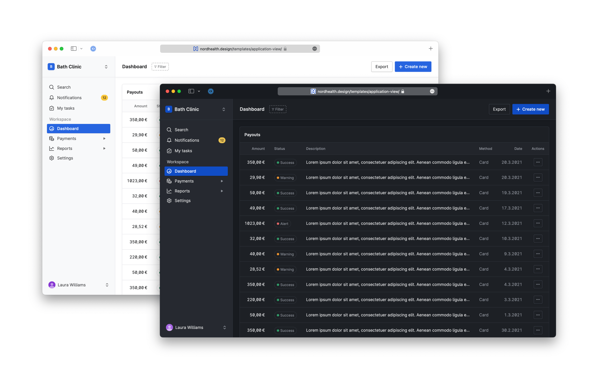
}Dark mode #
Dark mode is a user interface mode that displays light text on a dark background. Dark mode is helpful for those viewing device screens at night, in dark environments, or find darker UI more accessible. The reduced brightness can reduce eye strain in low light conditions.
CSS Custom Properties used in Nord’s theming make supporting dark mode incredibly quick and performant. A typical scenario here could be that we already have a light theme in an application, and want to build support for a darker counterpart. Nord now supports this out of the box so that we can provide a better experience for our users.
Theme Builder #
We’ve created a tool called theme builder that our teams can use to test out the existing themes and the provided theming options. This can be useful for demonstrating the theming capabilities to users.
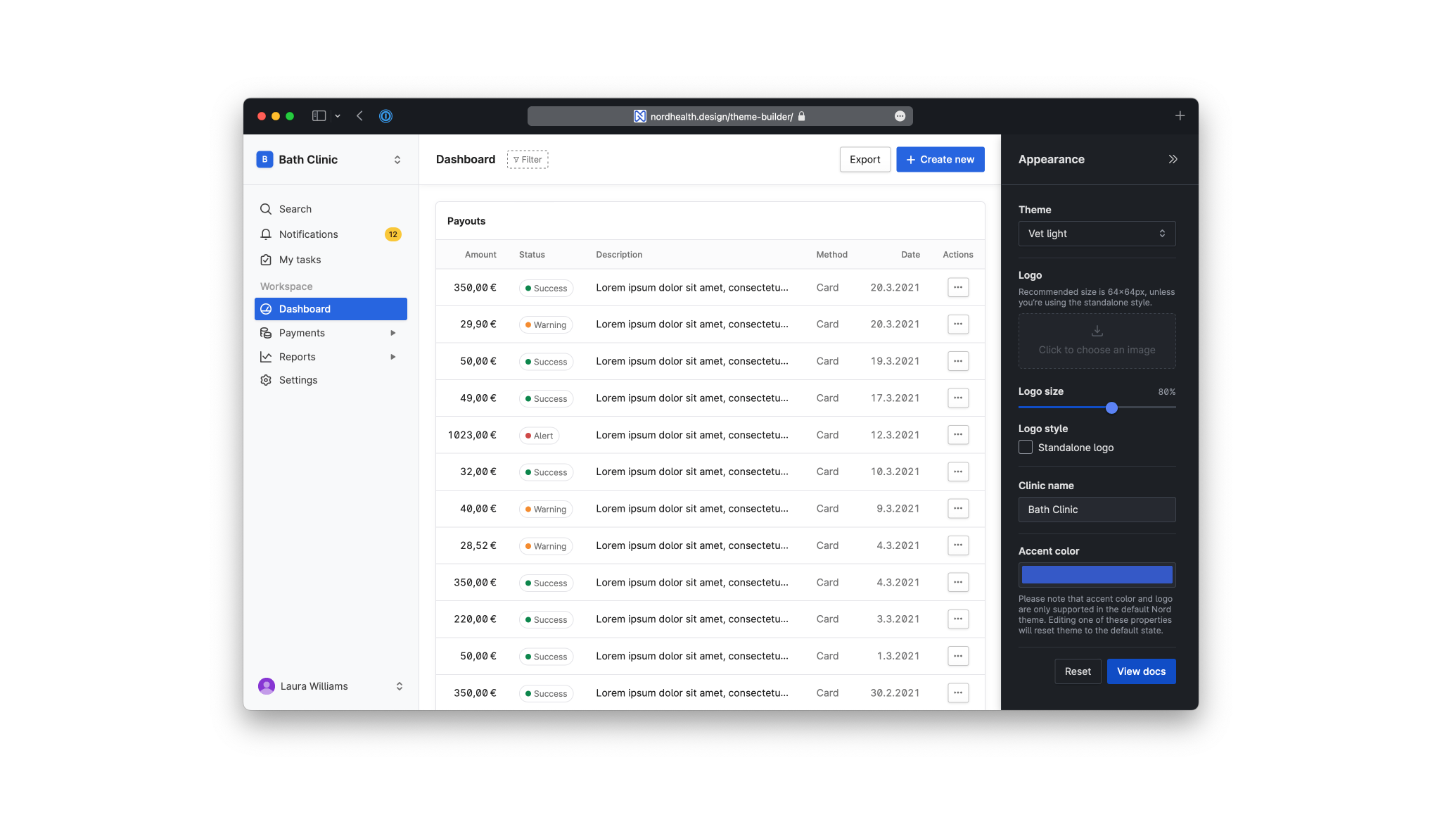
Theme builder allows developers to try features such as Accent color before implementing them into production environment and demonstrates how to programmatically pick the right text color based on the contrast ratio using our provided getTextColor function:
/*!
  * Get Nord text color for chosen accent color.
  * Derived from work by Brian Suda and Chris Ferdinandi.
  * MIT License.
  *
  * @param  {String} A hex color value
  * @return {String} The contrasting color (#0c1a3d or #fff)
  */
function getTextColor(color) {
  // If a leading # is provided, remove it
  if (color.slice(0, 1) === "#") {
    color = color.slice(1)
  }

  // If 3 character hex, convert to 6 character
  if (color.length === 3) {
    color = color.split("").map((hex) => {
      return hex + hex
    }).join("")
  }

  // Convert to RGB value
  const r = parseInt(color.substr(0, 2), 16)
  const g = parseInt(color.substr(2, 2), 16)
  const b = parseInt(color.substr(4, 2), 16)

  // Get YIQ color space ratio
  const yiq = (r * 299 + g * 587 + b * 114) / 1000

  // Finally return contrasting text color
  return yiq >= 160 ? "#0c1a3d" : "#fff"
}
The above function can be utilized with for example a color input. When the input value changes, we can set the new accent colors into a :root CSS pseudo-class:
<label for="color">Accent color</label>
<input id="color" type="color" value="#3559c7" />

<script>
  const input = document.querySelector("#color")
  const root = document.documentElement

  input.addEventListener("input", () => {
    const color = input.value
    const textColor = getTextColor(color)

    root.style.setProperty("--n-color-accent", color)
    root.style.setProperty("--n-color-text-on-accent", textColor)
  })
</script>
Design Tokens #
Design tokens are a central location to store design related information such as colors, fonts, sizes, and transitions. These raw values are automatically transformed to different formats like Sass, CSS, JSON, and more. Nord Design System uses design tokens instead of hard coded values to ensure a better UI consistency across different platforms (hat tip to Jina!).
Please note that in most cases developers don’t have to install our design tokens package directly, they can use our CSS framework instead as it imports this package internally and gives access to both the tokens and a wide range of shorthand utility classes to modify an element’s appearance in their application.
Web Components #
Nord makes it effortless to implement and use its components across any framework or no framework at all. We accomplish this by using standardized web platform APIs and Web Components.
We’ve chosen to use Web Components because there is a strong requirement for Nord to be used in many different contexts and with varying technologies — from static HTML pages to server-rendered apps, through to single page applications authored with frameworks such as React and Vue.js. Web Components work great for Nord, because they:
- Are tech-agnostic instead of tech-specific
- Future proof our system with Web Standards
- Allow us to use any framework or no framework at all
- Provide great encapsulation for styles and functionality
React Components #
Whilst React supports Web Components, they are sligthly awkward to use as-is. For this reason, we provide React-specific wrapper components in a package called @nordhealth/react. This will allow developers to use the Nord components as you would any other React component.
A planned future release of React will greatly improve support for Web Components, which will make the wrapper components unnecessary. But until then, we recommend their use.
import "@nordhealth/css"
import { Button } from "@nordhealth/react"
import ReactDOM from "react-dom"

function App() {
  return (
    <Button variant="primary">Hello world</Button>
  )
}

ReactDOM.render(
  <App />,
  document.querySelector("#app")
)
CSS Framework #
Nord Design System’s CSS Framework includes a wide range of shorthand utility classes to modify an element’s appearance in your application. The primary goal of this framework is to provide a method of styling elements with as little friction as possible.
Our CSS Framework also makes it possible to use the design tokens through memorable CSS based utility classes. Developers can either use this framework standalone, or with another CSS framework, as our CSS selectors are prefixed with .n- to prevent collisions.

RTL Support and Logical Properties #
Historically in CSS, we used to apply properties such as margin relative to the direction of their sides. For example, margin-left was applied to the physical left side of an element. With logical properties, margin-left becomes margin-inline-start. This means that regardless of the language and text direction, the element will always have appropriate margin rules even in right-to-left languages.
Supporting multilingual applications and websites was an important requirement for Nord Design System. This is why we’ve made sure to use Logical Properties across all of our tools and also built test automation that warns us if we accidentally use the old style properties such as margin, padding, or border.
Rachel Andrew explaining the logic:
… these values have moved away from the underlying assumption that content on the web maps to the physical dimensions of the screen, with the first word of a sentence being top left of the box it is in. The order of lines in grid-area makes complete sense if you had never encountered the existing way that we set these values in a shorthand.”
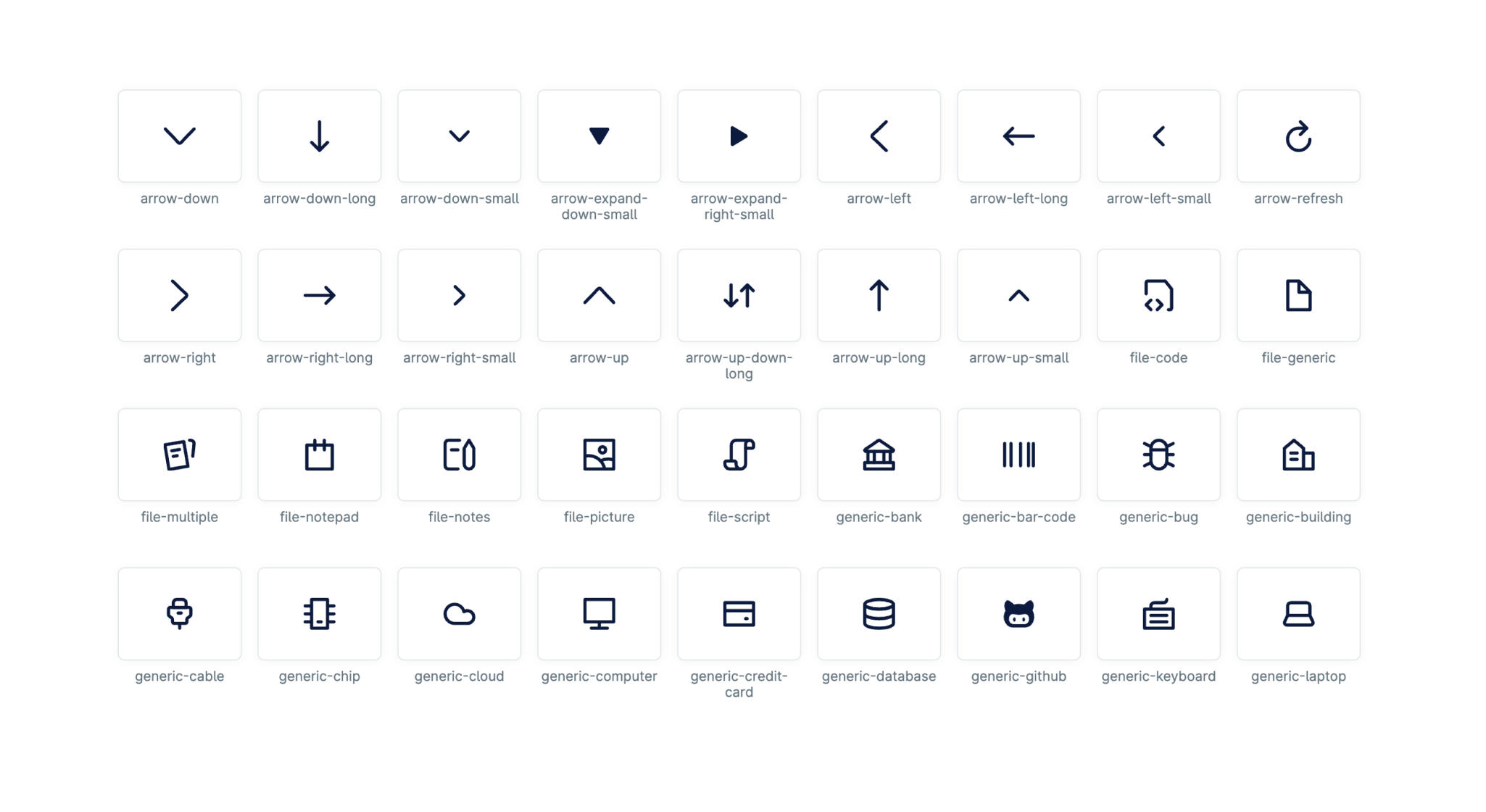
Nordicons #
Nordicons is our proprietary icon library. We use Nordicons to provide additional meaning or in places where text label doesn’t fit. They communicate messages at a glance and draw attention to important information.
The easiest and recommended way to use Nordicons is via our dedicated Icon component that allows developers at Nordhealth to use all our icons and set their size and color according to our design tokens. The icon component provides properties that allow developers to adjust the following:
- Name of the icon from Nordicons
- Size of the icon according to our icon sizing tokens
- Color of the icon according to our color tokens
- Accessible label for the icon
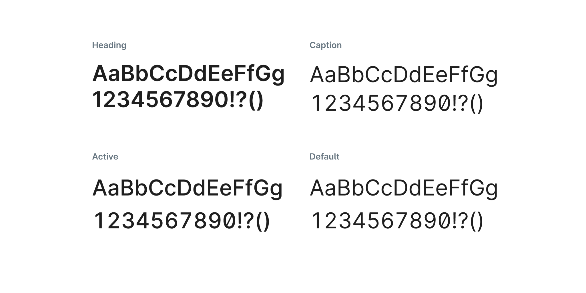
Webfonts #
Nord Design System provides a constrained, purposeful set of typographic styles that we use to present user interface and content as clearly and efficiently as possible.
For digital products, we use a typeface called Inter which is carefully crafted and designed for computer screens specifically. It features a tall x-height to aid in readability of mixed-case and lower-case text. Several OpenType features are provided as well, like contextual alternates and slashed zero for when you need to disambiguate 0 from O.
Nord CDN #
Nord serves all of its packages via a Content Delivery Network for better performance and stability. Nord CDN also makes it fast to implement and use our packages for design work and prototyping user interface features. Some of the benefits of using Nord’s CDN include:
- Faster load times and better performance for all users
- CDN scales more rapidly during heavy traffic
- Minimizes risk of traffic spikes at point of origin, ensuring stability
- Decreases infrastructure costs due to traffic offloading
- Faster to get up and running with development work

Documentation #
Finally, but not the least, we’ve put a lot of effort into documenting the usage of different tools and decisions we’ve made along the way. For this, we’ve used a tool called Eleventy which generates everything from our interactive component playgrounds to static documentation pages that you can see on nordhealth.design website.
The documentation itself is public as it makes sharing and collaboration between different teams and third party vendors much easier as it increases the system’s visibility and accountability. This also makes us push towards higher quality and enables us to be more transparent. Finally, it serves as an amazing tool that we can leverage in recruiting.
What’s Coming Next #
The Nord team is excited to finally bring these updates to everyone working at Nordhealth! 🥳 All of our tools are out of beta phase starting today and ready for production usage. There’re obviously many items we wanted to see in version 1.0 that didn’t quite make it. We’re excited to bring those to our users later this year. Next, we’ll be focusing on the following features:
- Improved internationalization support for Web Components
- Product team support by setting up knowledge-sharing processes that promote collaboration, pairing, and training
- Forming new Nordhealth wide contribution models
- Improving our test and process automation
- Defining backlog prioritization model
- Adding more features, components, and fixing bugs
- And more…
If you have questions or feedback for us, feel free to reach out to us via Slack, Office Hours, Monthly Meetups, and also the feedback functionality found from the bottom of each page. Hope to hear from you soon. ❦
P.S. We’re hiring for Nord team!
P.P.S. We’ve got interesting statistics about Nord here!
Likes (56)


")


In case you missed it, I wrote yesterday on my own website (it’s been a while!) about all the tools and features shipped in Nord v1.0: viljamis.com/2022/launching…
April 6, 2022