Manually adjusting line-height with media queries for optimum readability across vast number of screen sizes can be hard. What makes it even harder, is, that instead of the screen width, the line-height should be relative to its container’s width and its font settings in order to achieve proper readability and appropriate spacing.
Molten Leading is a tiny JavaScript plugin that automatically adjusts line-height based on element width for optimum readability across vast number of devices.
Thanks to @Wilto, there has been a jQuery plugin called “Molten Leading” around for quite some time already which makes it possible to automate this process and define a minimum width at which the adjustment starts, a maximum element width where it stops, and a minimum and maximum line-height to adjust through.
I wanted to use something similar in one of my latest projects, but I didn’t want to introduce new dependencies to external JavaScript libraries just because of this one feature. I also wanted something that would have a bit better performance, so I decided to write a custom version of Molten Leading without any library dependencies. All this is now available on GitHub too, so take a look and give it a spin.
Today, we are open sourcing the JavaScript code and the assets we used to build the responsive navigation on Adtile’s website. The code and examples are hosted on GitHub and can be found from here. There’s a live example too, under Adtile’s site, give it a spin. Read more about the features provided from the link below.
While I’ve worked over a decade building various websites, it has only been the past 3 years that I’ve started learning more on how to work with plain JavaScript, instead of using jQuery always as the starting point. The fact that I’m learning a dozen new things every day now, has made working on Adtile’s JavaScript SDK feel more like building an open source project than actual work, and I have to say I like that a lot.
Today, I’m going to share some of the basic things I’ve learned during the past years, which will hopefully also help you to dive into the world of plain JavaScript, making it easier to decide whether or not you will need jQuery in your next project.
Today, after over two years, I’ll be leaving my position at Kisko Labs. I’ve started working on a new responsive advertising solution for smartphones and tablets called Adtile. Another big news is, that we have just received a $2.7 million funding to bring this product to the market. There’s also a story about us on TechCrunch, so check that out.
Banner ads might still function well in print, but it’s clear that they just don’t work on screen and especially on mobile devices anymore. Instead of trying to make the current model work somehow, we decided to start with an entirely new idea and ditch the old model—and the annoying banners. As we are focusing on mobile and building a customizable SDK for both web and native app developers, we will be also building another device lab soon only for this purpose.
The company where I’ll be working at, TenFarms, is based in Los Angeles, so I will be most likely spending time in the US a lot more too. Besides Adtile, I’ll be soon revamping the whole web presence of our second product, Photopoll iOS application too.
Responsive Nav is a tiny JavaScript plugin which weighs only 1.6KB minified and Gzip’ed, and helps you to create a toggled navigation for small screens. It uses touch events and CSS3 transitions for the best possible performance. It also contains a “clever” workaround that makes it possible to transition to height: auto, which isn’t normally possible with CSS3 transitions. The plugin, along the site, was released today on Smashing Magazine.
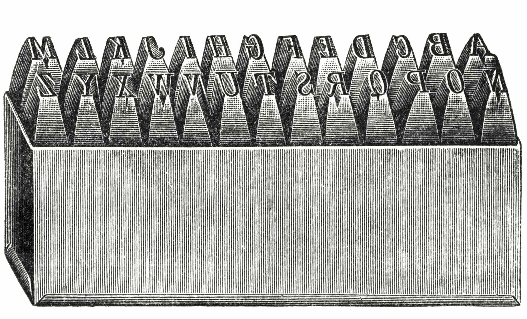
The history of typography dates back about 5,000 years. It starts from a series of pictograms, which then evolved to hieroglyphs in Egypt and later around 1,200BC to Phoenician alphabets. Almost 2,500 years later the Chinese invented first movable type which later revolutionized everything in the west when Gutenberg invented latin movable type. Many of the basic concepts of typesetting are still the same as 500 years ago.
Web typography, and digital typography in general, is a huge step forward in this history. It has made setting type fast and easy compared with hand-setting metal type. Responsiveness, when added on top of this, makes this period of change we are living very fascinating. Not only is centuries old design theory being rewritten, but the process of how design happens is now changing too (as Mark Boulton states it).
Universality, as a design principle, should guide us when choosing fonts and when testing how our type works on various devices and platforms.
When talking about “responsive typography,” I don’t just mean flexible body text, but also that all our decisions should be based on universality. Universality, as a design principle, should guide us when choosing web fonts and when testing how our type works on various devices and platforms. It should be the core principle behind all the work we do.
I were quite surprised few weeks ago when I found out with Matt, my colleague, that no one has tested thoroughly which mobile browsers support input type=file and how to reliably detect the support. After an hour of Googling we literally gave up and decided to find it out ourselves. The results are shared here to everyone for future reference.
For the detection part, I am using similar code as Modernizr does, but I’ve added a separate user agent regexp to check against browsers that falsely report support. There are quite many of those false positives really, at least all Windows Phone devices running OS 7.0-8.0, Android devices running OS 1.0-2.2, Kindle devices running OS 1.0-3.0 and all WebOS devices running OS 1.0-3.0.5 (Although the latter ones being quite old already).